OUYA at First Glance

This inexpensive console has some real merit.

OUYALast week, as I was continuing to learn Android development, I was finally nudged into looking into the new OUYA console.  For those unfamiliar, the OUYA is an Android-based gaming console that sells for less than $100.  It got its start with a hugely successful Kickstarter campaign and, while it is not intended to compete with the PS4 and XBone launches, it is a legitimate player in the console market.

The reason that we considered the OUYA is that it is designed from the outset for open development, which makes it accessible not only for established indie developers like Digital Gamecraft, but also for anybody with an interest and just a little ability, and those who actually produce marketable games can find their titles listed right alongside AAA developers.  The unique thing about OUYA games is that all of them are free to try (so it is, in essence, a shareware console).

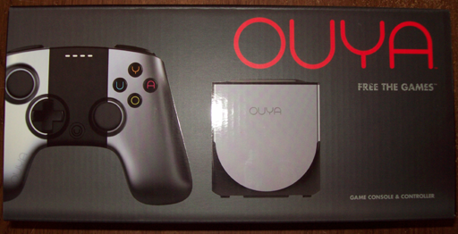
Acknowledging that it was a tiny investment, not to mention cheaper than most Android tablets or phones, we made our order on the spur of the moment, and 3 days later our OUYA arrived at the doorstep:

OUYA boxOf course, December is winter here in Michigan, which means that I had to wait a few hours for the electronics to come slowly up to room temperature.  During the wait, I contemplated how I had heard various complaints about the OUYA, but thus far, everything was very professional, exceeding my expectations.  Meanwhile, the contents of the box just sat on my auxiliary desk in anticipation:

OUYA package contents

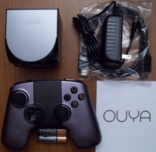
The first thing that surprised me was how small the console itself was; it literally fits in ones hand, and it is smaller than the controller in two of three dimensions.  I was also surprised, and delighted, to find that the box included an HDMI cable, a very nice touch that is usually overlooked (cynically: deliberately left out to make more retail profits).  Indeed, if one counted the retail prices of the controller, HDMI cable, and batteries, the console itself was quite inexpensive indeed. 🙂

Finally, the time came to set everything up, and I ran into my first issue.  Therefore, I will start with the (few) cons that I experienced.  The OUYA is a bit short on traditional documentation, so there is nothing explaining how to install the batteries in the console!  I challenged our local console expert, and he was unable to figure it out, either.  (A Google search reveals that we were hardly unique in our confusion.)  Also, after a bit of use, it becomes clear that the OUYA has no ventilation to speak of, so it becomes a rather effective hand warmer in a chilly office, but this will likely be a liability in summer.  Returning to the initial complaint, it turns out that the black area in the middle of the controller is a touch pad (!), which fact I did not discover on my own.

On the other hand, there were more important pros.  The installation process, including the downloading of a system update right away, was embarrassingly simple, especially when compared to the PS3, as well as humorous (even in the license agreement).  The display is extremely clear, even on my poor 720p office/development television.  The whole interface is straightforward and easy to understand, and the purchase process is just about as painless as it could possibly be.  The controller (contrary to some opinions) is solid and comfortable to use, and, of course, this whole system was inexpensive.

The available game software is certainly the most fundamental aspect of a console, and unsurprisingly, this is a bit of a mixed bag, at least in my limited experience (so far).  You have top games, such The Cave (currently #1), which delivers everything that one would expect, and others, like Amazing Frog? The Hopping Dead (#3), which seems to have come up a few weeks short of prime time.  I really wanted Pinball Arcade to be as good as their attention to detail, but alas, the delay between clicking a controller button and the flipper reaction makes the game totally unplayable.  Conversely, and promisingly, the OUYA version of Galaxoid, by lone developer Jacob Davis, is loads of fun (for just a few bucks).  This variety makes the ability to try games that much more valuable.

The next step is development.  Though I spent a little time playing with the OUYA as a consumer would, I have been too busy with paying work to install the ODK (OUYA Development Kit) and build anything for this new console.  You can be sure that I will post more about the OUYA after that happens.

Acknowledgements: 3 Great Tools

Here are some invaluable tools we used for DemolishPairs.com.

With the release of Demolish! Pairs and a number of other projects in the works, it has been a busy time here at Digital Gamecraft.  We finally got around to finishing the DemolishPairs.com web site (for now :)).  Now, I want to acknowledge three of the tools that proved particularly important to that task.

The first tool, and one of the most important in my arsenal, is Beyond Compare by Scooter Software.  I have mentioned before (and will probably continue to do so) that this is a product that I use almost daily and it is extraordinarily useful.  It performs both excellent file comparisons/”diffs”, showing (in this case) what changes we have made in HTML or code, and fantastic synchronization of files, so we can tell at a glance which files are updated and then copy changes to the servers (usually after verifying the diffs).  After using this tool, Dreamweaver is lacking and Expression Web is downright painful, so we exit either tool to publish with Beyond Compare instead.

The next tool is 3D Box Shot Pro, by Jellypie Software, which does a lot more than merely box shots.  For our iOS app, it generated wonderful 3D images of the screenshots on iPad and iPhone devices, which you can (finally) see on the Demolish! Pairs web page; they really make the page look much better.  I especially want to thank Andrew Gibson for actually generating these images (and more) and opening my eyes to the benefits of this software.  Here is more information and a short video showing how to make a 3D iPhone (or iPad) model with 3D Box Shot Pro.

The final tool is CSE HTML Validator by AI Internet Solutions.  This software validates your web site by checking your HTML (and CSS, etc.) files for issues that either will or could cause problems, and helps to make your site better all-around.  (It is like PC-lint for web sites: essential.)  Having used all of the validations in Expression Web successfully, I foolishly assumed that everything was fine with the site, but Dexter Bell (developer of FileBoss) pointed out that I had made a fundamental error with my HTML/CSS.  The tools from Adobe and Microsoft let it slide, but HTML Validator flagged it right away.  You can get an idea how thorough the product is with an online validation (but if you check mine, you may see that the iTunes link Apple provided me is invalid 🙁 ).

If you are developing a web site, I strongly encourage you to check out all three of these tools to help make your job easier, better looking, and more robust.

Two Weeks of iPad

The Apple iPad lives up to its billing as a “game changer”.

After two weeks of using the Apple iPad, I am confident that the introduction of this device is going to be seen as a major event in the history of computing (despite the overwhelming hype trying to convince me of exactly that).  There is a reason that more than half a million iPads were sold in the first week, and that is before the 3G and international releases.

It is not that the iPad itself is a perfect device; it is not.  Nor is it that the idea is unprecedented, as tablet computers have been available for years (and it has been called merely a big iPod Touch).  However, where Apple excelled (in this case) was in the product design of both the hardware and the software, and coupled with the small technological advances, the result is significantly more than the sum of the parts.  Finally, Apple has successfully conveyed this “vision” to the consumer.

What makes the iPad special is the flexibility that the very simple physical interface (basically, just a big multitouch screen) affords.  When an application is launched, the iPad takes the desired form, whether that be a book, a map, a browser, or a game, and it does so wherever the user wants to be.  Psychologically, this makes a really big difference, which is probably why so many people are raving about the iPad.

In our household, we have already run into device contention.  My wife has laid on the living room floor using the iPad to map out a High Adventure canoeing trip for this summer.  My son gets up early in the morning to play games on it, or to use it to browse for information related to games he plays on his computer or video games consoles.  I have gotten back into reading literature for pleasure (which I have been intending for a while) because iBooks is well-suited for that.  In the evenings, we generally have the iPad nearby as we watch television or movies because we inevitably want to look something up on IMDb (instead of getting out a heavy laptop or going to the office desktop as we did previously).  Of course, there are sighs of discontent during the day when the hardware is roped into the office for its original purpose: software development.

Personally, I think that the iPad will anchor a new category of computers that fits among the various other kinds of computing devices  Most of the general complaints about the iPad I have read are in comparison to these types: it does not function as a smart phone; it is too big to put in your pocket/not portable enough; it does not do as much/is not as powerful as a laptop; it not as productive as a desktop system.  I think that smart phones, portable game systems, laptops and desktop computers are here to stay, but they will have to make room for the iPad and other slate computers.  That said, I think that the category of “NetBook” computers may be done for.

In practical terms, here are the three largest (albeit minor) complaints I have found about this first generation iPad:

  1. The reflective screen really shows smudges and gunk (such as cat hair).  I have no problem reading it, but I compulsively wipe fingerprints or grit from the screen, and I cannot count the number of times I have unintentionally turned book pages or linked to an unwanted web page doing this.  (I suppose the lock button solves this, if I can train myself to use it.)
  2. The clock application was omitted from the list of provided applications.  The iPod Touch is my only alarm clock, and it only makes sense that I should be able to take the iPad to read in bed and also set it to wake me in the morning, especially since the same program would already work.  (One can set a reminder with an audible alert, but it is not the same as an old car horn.)
  3. The iBooks application, while ostensibly providing a virtual bookshelf, does not allow freeform rearranging of books on those shelves.  Sure, one can delete books and change their order, but they always gravitate to the top left.  What if I want to put my books on the left, and Sherry’s books on the right, and those that we have already read on the bottom shelf, huh?

The final unfortunate aspect of the iPad is that, due to its popularity, I have to start a pool for the date of the first time that the iPad is dropped on the floor (or sat upon), and for when it will actually be broken in such an incident.  Those who chose “less than two weeks” have, thankfully, lost.

Windows 7 Escapes

Microsoft releases its latest operating system.

Last week, Microsoft published Windows 7, the successor to Vista, to some fanfare.  The reviews have been fairly positive, perhaps because Vista softened the audience, but it seems that the sales tag line should be “Windows 7: what Vista should have been.

We tested the new operating system, in a couple of virtual machines, by running Sun VirtualBox virtualization software.  My first impression was that this was a great productVirtualBox, I mean.  Although I have not yet delved into the advanced features, it did exactly what we needed with a minimum of fuss and bother.  We were able to test both Windows 7 x86 (32-bit) and Windows 7 x64 (64-bit) on the same 32-bit Vista host system without serious problems.  In fact, the only problem we experienced was an inability to find a 64-bit sound driver through Windows Update (so our x64 VM did not have sound).

Back to the operating system, we found it to be perfectly adequate.  It performed as expected and was easy to use (for somebody already used to Vista, anyway).  There is nothing particularly revolutionary, but (as with the update from Windows 98 to Windows 98se) everything seems to be more polished, with a few minor features added.  The big change, really, is that the 64-bit version is becoming mainstream (whereas the 64-bit support for the previous versions was not quite ready for prime time).  It is for this reason that I am likely to upgrade my development system to Windows 7 x64 in the near future.

Some of the changes include the ability to “pin” an icon to the task bar (replacing the Quick Launch toolbar), and a new management feature for task bar (a.k.a., tray) icons, allowing the user to control when these icons are displayed or hidden.  In order to encourage users to make use of this feature, Microsoft kindly made their own icons here very ugly, so the first customization item is to get rid of them.  (This will also facilitate ignoring the loads of useless preinstalled junk that comes on some new computers.)

As far as developers are concerned, nothing much has changed.  As long as your software is Vista-compliant, it will probably run unmodified under Windows 7. All of our recent product releases worked just fine; the only items noted were the (now) missing Quick Launch toolbar and the task bar icon disappearing (i.e., being hidden) after its first appearance.  The only significant caveat, though, is that 16-bit applications (those built for Windows 3.1) will not run (directly) in Windows 7 x64.

Of course, I do have a couple of recommendations for Microsoft to consider in the future.  First, they should probably do a better job of considering the symbolism they (perhaps, inadvertently) put forward.  The default wallpaper for the beta and release candidate versions of Windows 7 was a male Siamese Fighting Fish, also known as a betta.  (“Get it?”)  The latter name may be punny, but the fact that these fish (at least at the pet store) have to have separate enclosures because they are nasty and do not play nicely with the other fish suggests that Win7 is intended to be likewise.

Also, perhaps underlining the above weakness in Microsoft’s overhyped marketing capabilities, I will point out that they had great successes with Windows 3.0 and Windows 3.1 (standard version numbering), as well as Windows 95, Windows 98, and Windows 2000 (release year numbering), moderate successes with Windows 286/386 (hardware support), Windows NT, and Windows XP (opaque version lettering), but commercial failures with Windows Me, Windows Vista, and even Windows (1.0, initial release) itself.  I suggest that Microsoft stop trying to “evoke” some greater vision and stick to practical version identification.

Finally, I note that the “Starting Windows” screen of Windows 7 is the best feature of the product, nearly perfect for its purpose.  It is too bad that the same design was not carried through to the system icons, which really are a step backwards in aesthetic terms.

Touch-A, Touch-A, Touch Me

My iPod is Dirty.

A couple weeks ago, we ordered our latest toy, I mean, tool for development. We got a new iPod Touch, deliberately choosing the smaller (8G) model available and receiving it before the iPhone 3.0 Software Update was automatically installed.

Initially, the intent was to familiarize ourselves with the technology, from a user perspective, but this device turned out to be much more than mere technology. I am astounded at the design (and/or happy coincidence) that went into the iPod Touch (and, presumably, the iPhone). It arrives in a plastic box the width and length of a 3×5 index card, and only about an inch thick. By “it”, I mean everything that one needs: the device, the USB (data/charging) cable, a set of ear buds, a cleaning cloth, the Quick Start guide, and two of the ubiquitous Apple stickers. Also, the device comes fully charged, like other Apple products and unlike most other battery-operated devices. The first impression is just brilliant.

The iPod Touch itself is about 2.5 x 4.25 inches, and only a quarter inch thick, but it has enough heft to feel substantial. Shiny does not hurt at all (and ordering directly from Apple allows one to personalize the back with two lines of laser engraving). The genius of the device, however, is not in the specifications, but in how everything works together to create a physically satisfactory experience. One wants to pick it up, hold it, use it, even if there is not that much to do with the default applications. (I suppose that if it were an iPhone, we would be making unnecessary phone calls, too.)

The pre-installed software is sufficient to show off the basic features, and I imagine that most users try almost every application at least once and probably even make an excuse to use some. (I tried the alarm clock feature to avoid a four foot journey to the real alarm clock.) However, these programs are quickly exhausted, so the “App Store” becomes important for finding something else to do, another justification for playing/working with the iPod Touch. I believe that this contributes greatly to the success of this channel.

One thing that would be a great application for playing with the curiously magnetic iPod Touch would be a solitaire game (or many) that worked particularly well with this hardware. Speculation about the possibility of a top brand of solitaire coming to this platform would be entirely justified.

(with apologies to Richard O’Brien)

A Tale of a Good Anti-spam Tool

Spam, spam, go away… You are not welcome ANY day.

My approach to my primary email address, from the very start (more than 13.5 years ago) was that potential clients and customers should be able to contact me without jumping through hoops, so I have never bothered to hide or obscure my address: seelhoff@sophsoft.com . I have always published it in plain view (and to do otherwise would now be closing the barn door long after the horse has bolted and gone on to live free and happy until dying of old age).

Of course, this also allows any spamming slimebag with an address harvester to easily add me to each and every email database on the planet, so I do get spam. Lots of spam. To be honest, though, the level of spam to my “open” account seemed to plateau fairly quickly, although I never really kept track. Over the years, it may have been slowly and steadily rising, but I know that my patience has been slowly and steadily declining, so a while ago, I added some tools to stem the tide.

Let’s talk numbers, first. Since the beginning of April, my primary email account has received 75,000 email messages. Of those, almost exactly 98% are spam. Of the other (legitimate) messages, 80% are business (1.6% of the total), and the remaining 20% (0.4% of the total) are personal. Both of these categories include active mailing lists, such as Carbon and DirectX development (business) and community events (personal). I set up my email client to automatically sort these (and marketing messages) into appropriate folders, and the number of messages specifically to me, from clients, customers, family, and friends, is just a handful per day. These are the only ones that actually hit my inbox and trigger a notification sound.

To be honest, not all Bayesian filtering is created equal, and my email client is probably about average. It handled much of the junk, but an annoying number of spams were being missed, and signalling me (incorrectly) that I had a legitimate message. When I finally had enough, I downloaded and installed POPFile upon a recommendation from somebody in the ASP. I had been leery about installing an interim mail server on my system simply for filtering email, but it turned out to be an excellent choice.

After several months of training, POPFile is 99.92% accurate selecting among business, personal, and spam classifications and, importantly, I have gone for more than a month without a false positive for spam. (Most of the classification “errors” are simply unclassified messages that need to be trained.) Used in series with my email client, I can review messages that either think may be legitimate (ideally, to never miss a valid email), but I am only notified of incoming mail if they both agree on the validity. This has greatly reduced interruptions and made my days more productive.

Of course, there is some training involved so POPFile can “learn” the difference between legitimate messages and spam, but the initial process goes pretty quickly (and when one averages more than 1000 messages per day, there is lots of data). If I were to start all over again, I would not have chosen to have business and personal messages separated, since that distinction is not particularly necessary for me (and not always clear, either, such as when a family member reports a server problem, or a business associate invites me to a party).

If you are looking for an anti-spam solution local to your own system, I strongly recommend POPFile.

Making Mac Disk Images Pretty

This is how to add that “curb appeal” to your Macintosh disk images.

Important update:  Be sure to read Disk Images Revisited, the quick synopsis of which is that this method does not work properly on Snow Leopard due to a Mac OS X bug.  (Building disk images under Tiger or Leopard works fine.)

In a previous posting, I explained the basics of making Macintosh Disk Images for software distribution. By following that method, using free tools from Apple, you can create a basic disk image (.dmg) file that is suitable for downloading. The only problem is that, when mounted, it appears simply as a plain window with the bundle (and any additional files) in it. Utilitarian, at best.

We wanted something more like this:

Pretty Good Solitaire Mac Edition 2.0

This gives a much better initial experience, being not only more visually appealing, but also providing some initial instructions (text in green). Note that the ‘Pretty Good Solitaire’ and ‘Readme’ icons are live, while the rest of the window is simply a background image. In addition to this display when the disk image is mounted, we also wanted to add a license agreement before that happened.

We accomplished what we wanted (the image above being an actual screen capture from our upcoming release), and this is how we did it.

First of all, this can be accomplished, in theory, using the ‘Disk Utility’ and other free tools included with Mac OS X, provided a certain amount of legwork both in figuring out and then in executing the process. Upon a recommendation in the private ASP (Association of Shareware Professionals) newsgroups, however, we tried and settled on an inexpensive third-party tool called DropDMG, from C-Command Software. Not only does this save time and hassle, but it provided an added feature that we did not even know we wanted. (The trial version is fully-featured, and for only $20 the decision to purchase took no deliberation.)

Even with this tool making life easier, it is important to note that the process is slightly convoluted, primarily because one needs a relative path to background image. In our first few attempts, we managed to have backgrounds that showed only on the development system, but disappeared (rather, never appeared) when downloaded to another system. The basic approach is to create a writable disk image first, with the desired contents (including the background image), then arrange this malleable window as desired, and finally convert that into a final (read-only) disk image for distribution.

The first step is to create the desired background image (which is left as an exercise for the reader); it should probably be a non-lossy PNG file for best results. This file should generally be “hidden” in the disk image, and (according to warnings I chose not to test) needs to be in a subfolder, not the root of the disk image. The most common, even ubiquitous, recommendation is to make a hidden subfolder and place the background image in that. However, we took a slightly different tack, by way of the following trick:

Add the background image (say, install.png) to your product bundle in Xcode. Our software has a ‘resources’ folder that contains various images used in the game, and by simply copying the background bitmap there and then adding the file to the project, it is included in the application bundle. This way, there is no messing around with an extra folder just to hold a single file, and if a system is configured to show hidden files, there is not a rogue “.background” folder icon floating around, messing up the layout. (The drawback is that the bundle is slightly larger, but the download size would be essentially the same, and an extra 100K on a hard drive is negligible these days.)

Once you have the background image created and included in your project, follow the setup process in the original post, by creating a distribution folder (named “Pretty Good Solitaire 2.01” in our example) and copying your application bundle and any other files/documentation (e.g., “Readme.txt”) into it. This will serve as the basis of the final disk image, so make sure that everything is up to date.

Now, this is where DropDMG comes into play. Launch this application and create a default configuration for writable disk images (which we, creatively, called “writable”). Select ‘DropDMG->Preferences…’ from the menu, and then in the dialog box, for ‘Format’ choose “.dmg Read-write (can be modified)”. Frankly, the other settings do not matter much here, so leave the default values. Finally, select ‘Save Configuration As…’ (Command-S) from the ‘Configuration’ box and save this configuration, then close the window.

Next, select “writable” (or whatever named you chose) in the ‘Configuration’ box of the ‘DropDMG Status’ window. Then, simply drag the distribution folder onto this window, and a disk image will be created and placed (by default) next to the distribution folder. The log file will reflect this action (as in, Created “Pretty Good Solitaire 2.01.dmg”).

The next step is to mount (and open) the writable disk image, which can be done simply by double-clicking on it in Finder. This window can then be configured as desired, including resizing, setting icon sizes and positions, and (of course) changing the background image. Here are the steps that we take to do this:

  1. Press Command-J (‘Show View Options’).
  2. Under ‘Background’, select the ‘Picture’ radio button.
  3. Click on ‘Select…’ to choose the background image.
  4. Select the mounted disk image (under ‘Devices’).
  5. Press Shift-Command-G (‘Go to Folder…’).
  6. Type the name of the application bundle (e.g., “Pretty Good Solitaire.app”).
  7. Browse ‘Contents’ for background image file (e.g., “resources/install.png”).
  8. Click on ‘Select’ button.
  9. Resize window to fit background image (if necessary).
  10. Reposition icons as desired.

Once you have this done, unmount the disk image, and the layout configuration will be saved. (You can double-click on the .dmg file again to verify this.) Note that it is essential that the background image be selected from the disk image itself (see step #4); otherwise, the link will be to a file on the current system that will (most likely) not be on a user system, and a plain white background will be used instead.

If you want to include a license agreement in the disk image, one that must be accepted before the disk image is mounted, then you will need to add one in DropDMG. Honestly, this part of the interface leaves a little to be desired, but to avoid confusion, here are the basic steps:

  1. Press Command-L to ‘Show [License] Agreements’ window.
  2. Press Command-D to ‘Add [License] Agreement…’ (name).
  3. Type a name for the new license agreement and click ‘Add’.
  4. Select the new license agreement in the window.
  5. Press Shift-Command-D to ‘Add Language…’ to that agreement.
  6. Choose a language and click ‘Add’.
  7. Double-click the added language and insert text as needed.
  8. Repeat previous three steps for each desired language.

At this point, return to DropDMG preferences again (DropDMG->Preferences…). This time, create another configuration for your specific product. Under ‘Format’, select “.dmg zlib-compressed (Mac OS X 10.1)” (or another read-only option at your discretion). This will be the format of the final distributable disk image.

Under ‘Options’, you can select the license agreement added above, if desired. Check the ‘Use custom icon for mounted image’ option. This is the bonus feature that we did not even know enough about to know we wanted. Instead of a simple disk icon, when mounted the disk image shows a disk icon with the bundle icon superimposed on it (which you can see in miniature on the title bar in the example above). There is a way to create a truly custom icon, but we did not feel the need to go that far.

Also check the ‘Auto-open image window after mounting’ option, which causes your window landscaping to immediately appear to the user when the disk image is mounted, as intended. However, do not check the ‘Internet-enable’ option, as this will cause the contents to be automatically copied into the download folder, skipping all of the hard work you just did to get to this point.

Save this configuration (Command-S), close the preferences window, and then select the new configuration in the ‘DropDMG Status’ window. We are in the home stretch now…

Drag the writable (and beautifully landscaped) .dmg file onto the DropDMG window. This will begin a conversion to the new, distributable format. The action will be reflected in the log (as in, Converted to “Pretty Good Solitaire 2.01-1.dmg”). Rename the brand new disk image to something appropriate and upload it. Of course, you definitely need to thoroughly test it, as you would an installer for a Windows product, but if you followed these directions accurately, it should work for you. [Insert disclaimer about me taking no responsibility for your results whatsoever…]

Done.