Demolish! Pairs 1.1 for Android

An update of this fun puzzle/arcade game is available for Android users.

Demolish! icon

Last week, Digital Gamecraft® released a game update, Demolish! Pairs 1.1 for Android, which refreshes the product to support the latest technology, including Android 12, and brings Demolish! Pairs 1.1 for Android current with Google Play requirements.

This update parallels the release (last November) of Demolish! Pairs 1.3 for iOS, which likewise did not add any new gameplay features and required no bug fixes, but makes sure the software supports all the latest mobile phones and tablets.

Development

As noted, there had been zero bug reports for the product (on either platform), but Google Play has been steadily advancing the SDK requirements for products in the app store, so this update was a proactive step to prevent the game from being dropped from the store.

Clearly, this update was not an exercise in direct ROI (return on investment), as the Android version has had, literally, ones of sales. 🙁 Instead, this was an exercise (in frustration) intended to keep our tools and skills up-to-date, despite never having had a client request Android work, for reasons that seem fairly obvious (i.e., nobody pays for Android software).

Because the product had not been updated since its release in September 2018, it had last been built entirely with Android Studio 3.1, and while we had been updating Android Studio quasi-regularly, we had not been making the associated script changes (unnecessary on any other platform) to keep all the tools in sync. This fact alone makes Android development the least appealing of any platform; it takes so much non-programming effort to maintain.

We upgraded to the (then) latest Android Studio which, to my chagrin, has been named, “Android Studio Arctic Fox | 2020.3.1 Patch 4” (because “Android Studio 4.3” was too cryptic and, you know, left out the confidence-building “2020” from a 2022 download 😉 ). Then the real fun commenced, because (of course) the Gradle version was out of date, not to mention the fact that there are two different Gradle versions, and various helpers offered to upgrade these once, and then again, and yet again, to newer versions each time. Of course (because it could never actually just work, you know, like Visual Studio or Xcode), this upgrade chain ended before actually getting the correct versions installed, though it did install three (or is it six?) separate obsolete versions of Gradle, thus leaving me with loads of (all) incorrect options and the necessity to spend a significant amount of time searching the web for a solution. This should not be necessary for development (hello, Gradle) nor using an OS (that’s you, Linux).

Ultimately, I did find the solution and get the Demolish! Pairs code to build correctly, and no actual code (i.e., Java) changes were necessary. However, I did choose to migrate (per recommendation) to AndroidX, for which the conversion tool was essentially flawless. I also am a strong advocate of strict code linting, so I made a few code changes due to new lint messages, although only one that could have made any difference in program operation (and only then if it ran on a theoretical Android device that reports neither ‘portrait’ nor ‘landscape’ orientation, which should not exist in reality).

I should note that, despite its absurd naming, Android Studio is fairly nice to use (once Gradle has been subdued). The static code analysis (i.e., linting) system for Android/Java projects is comprehensive, albeit often self-contradictory, but once one determines which items are pointless and disables them, it is useful. Also, Google provides excellent online documentation of its SDK, the way Microsoft did. On the negative side, I shutter to think how many millions (or billions) of dollars worth of development time are wasted on Gradle configuration, and I weep that some managers think code metrics are a good way to judge source code.

The final hurdle for me was at bundling time. Now, to submit a product, one must supply an App Bundle instead of a prebuilt APK, but that was not the problem. The problem was that to build a final App Bundle (or APK), one must provide the certificate and type in its password. In the intervening 3+ years, which notably included my world being turned upside-down, I had forgotten and misplaced this password. The certificate had been diligently preserved, but without a password it would be rendered useless. After hours of trying different methods to retrieve the password (all failing, as they should), I finally took the tried and true approach: count the asterisks and guess. It worked! 🙂

So… Act NOW and you can be the first person to buy Demolish! Pairs for Android in the current decade!

Also: second January release: check.

Modern Mobile Icon Sizes

Icon sizes you need to support iOS 12 and Android Oreo devices.

With the explosion of mobile devices, it keeps getting more difficult to keep track of the myriad icon sizes required for mobile apps.  This post simply lists the required sizes and uses for iOS and Android devices (as of now).

When creating an application icon, it is best to start with an image that is (at least) the size of the largest icon necessary, which is currently 1024 x 1024, and then reduce that image to the necessary sizes, reducing level of detail as/if necessary for smaller icons.

iOS App Icons

As of Xcode 10 (iOS 12), iOSApple iOS devices have application icons for the app on three different device types (iPhone, iPad, and iPad Pro), the store, spotlight (search), settings, and notifications, and these icons may need to be provided in single (unadorned), double (“@2x”), or triple (“@3x”) scale factors.

For a “universal” app, you need to provide icons in 13 resolutions (for 15/18/19 different uses, depending on how you count).  iPhone only apps need 8 resolutions; iPad only apps need 9 resolutions.

Here is a list of the iOS icon sizes, along with a color-coded list of the uses:

  • 1024 x 1024
    • App Store – all applications  (<title>.png)
  • 180 x 180
    • iPhone application @3x  (<title>_iphone@3x.png)
  • 167 x 167
    • iPad Pro application @2x  (<title>_pro@2x.png)
  • 152 x 152
    • iPad application @2x  (<title>_ipad@2x.png)
  • 120 x 120
    • iPhone application @2x  (<title>_iphone@2x.png)
    • iPhone spotlight @3x  (<title>_search@3x.png)
  • 87 x 87
    • iPhone settings @3x  (<title>_settings@3x.png)
  • 80 x 80
    • iPhone spotlight @2x  (<title>_search@2x.png)
    • iPad spotlight @2x  (<title>_search@2x.png)
  • 76 x 76
    • iPad application  (<title>_ipad.png)
  • 60 x 60
    • iPhone notification @3x  (<title>_notify@3x.png)
  • 58 x 58
    • iPhone settings @2x  (<title>_settings@2x.png)
    • iPad settings @2x  (<title>_settings@2x.png)
  • 40×40
    • iPad spotlight  (<title>_search.png)
    • iPhone notification @2x  (<title>_notify@2x.png)
    • iPad notification @2x  (<title>_notify@2x.png)
  • 29 x 29
    • iPad settings  (<title>_settings.png)
  • 20 x 20
    • iPad notification  (<title>_notify.png)

Android App Icons

AndroidAndroid icon requirements had remained fairly consistent, but as of Android 8.0 (Oreo, API 26), those application icons are now classified as “legacy”, though still required for support on earlier devices (i.e., 85.4% of the market); the latest devices can use “adaptive” icons.  All applications should have a store icon.

For most Android apps, you should provide application icons in 6-8 resolutions (none of which overlap with the iOS resolutions).

Store Icon

Android apps, if they are to be published, require a store icon:

  • 512 x 512 – Google Play

Legacy Icons

To support devices running Android 7.1 (Nougat, API 25) and earlier, which you absolutely should, provide legacy icons in resolutions supporting 5 (or 6) different screen densities:

  • 192 x 192 – xxxhdpi
  • 144 x 144 – xxhdpi
  • 96 x 96 – xhdpi
  • 72 x 72 – hdpi
  • 48 x 48 – mdpi
  • 36 x 36 – ldpi (optional)

Note that some legacy icons can (technically) be omitted, but those sizes will be generated by the Android system from other sizes, and not necessarily the best resolution (i.e., a larger icon may be generated from a lower resolution icon, which looks poor).  Therefore, only the low density (ldpi) icon is considered optional; no modern devices are low density, and if one was it would necessarily generate the icon from a larger source.

Adaptive Icons

Adaptive icons were introduced in Android Oreo to allow the system to perform visual effects with the shape and/or contents of an application icon.  In order for this to be supported, adaptive icons need to be separated into foreground and background layers; the foreground contains the important content of the icon, toward the center, and the background is an image or color that may provide branding but could be clipped.

These are the components:

  • foreground – 108 x 108 image with transparency, icon content in center 72 x 72
  • background – color or 108 x 108 image to be composited with foreground

The foreground and background may be moved or sized independently before being composited together, and the resulting image will likely be cropped into an arbitrary shape; Android reserves an 18 pixel border for these kind of visual effects.

For more information, see this page about supporting adaptive icons.

Conclusion

For a mobile app to support all recent iOS and Android phones and tablets, you will need to create about 20 icons, in the resolutions above, including separate foreground and background layers for adaptive icon support.  If possible, start by creating an App Store icon (1024 x 1024) from a separate foreground and background.  Use that as a source icon to generate the smaller Google Play, iOS, and Android legacy icons, adjusting detail as necessary.  Finally, resize the foreground and background layers appropriately to generate the components for the adaptive icons.  (Then, take a deep breath.)

Now you are ready to implement your application. 😉  Of course, if you want to support Android TV, Apple TV, Android Wear, Apple Watch, Android Auto, and/or Apple CarPlay…

Demolish! Pairs for Android and iOS

Awesome puzzle game now available for almost any mobile device.

On Tuesday, Digital Gamecraft released both Demolish! Pairs 1.0 for Android and Demolish! Pairs 1.2 for iOS.  This pair of releases represents a recommitment to this product that is enjoyed by game players on a daily basis. Demolish! Pairs 1.0 for Android is the first release on the Android platform, after numerous requests, and it runs on 99.7% of Android tablets and phones. Demolish! Pairs 1.2 for iOS is a long-awaited update release that adds support for the latest iOS devices, including the iPhone X, and resolves compatibility issues with iOS 11. The goal of Demolish! Pairs is to remove pairs of adjacent, matching blocks until the entire board is cleared.  Each time a pair of blocks is removed, the blocks above (if any) drop down and empty columns are filled by pushing the remaining columns together.

Release Date

The release date, September 11, is significant, if somewhat coincidental.  (We decided to release the Android version on that date, and the Apple approval of the iOS version just happened to arrive later on the same day.) Demolish! Pairs began life as a secondary project in the early years of Digital Gamecraft.  After many years of discussing the idea, we started actual game design in August 1999, and we completed the first playable (Windows) prototype shortly thereafter.  A couple of years later, we made the decision to proceed with Demolish! (as it was known at the time) as a primary development project, and we were making good progress for a few weeks. The original design theme was an actual building that was being demolished brick by brick, and the gameplay was fun.  However, the events that occurred on that date 17 years ago suddenly made the idea of tearing down a building very disturbing, and it became clear immediately that the game could not continue along the same path.  We initially renamed the project to Diminish, making the destruction as abstract as possible, before finally shelving the whole thing for almost a decade. In early 2011, we picked up the project again, deciding to continue with the abstract design and target mobile devices, but to return to the original name.  We had a number of different play mechanics that we were implementing, but determined that the one with selecting only pairs of blocks was both unique and the most obviously skillful, so we focused on that particular mechanic.  Demolish! Pairs was born. The dramatic history of this game does not end there, but this post does. 😉

OUYA at First Glance

This inexpensive console has some real merit.

OUYALast week, as I was continuing to learn Android development, I was finally nudged into looking into the new OUYA console.  For those unfamiliar, the OUYA is an Android-based gaming console that sells for less than $100.  It got its start with a hugely successful Kickstarter campaign and, while it is not intended to compete with the PS4 and XBone launches, it is a legitimate player in the console market.

The reason that we considered the OUYA is that it is designed from the outset for open development, which makes it accessible not only for established indie developers like Digital Gamecraft, but also for anybody with an interest and just a little ability, and those who actually produce marketable games can find their titles listed right alongside AAA developers.  The unique thing about OUYA games is that all of them are free to try (so it is, in essence, a shareware console).

Acknowledging that it was a tiny investment, not to mention cheaper than most Android tablets or phones, we made our order on the spur of the moment, and 3 days later our OUYA arrived at the doorstep:

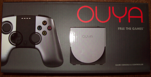
OUYA boxOf course, December is winter here in Michigan, which means that I had to wait a few hours for the electronics to come slowly up to room temperature.  During the wait, I contemplated how I had heard various complaints about the OUYA, but thus far, everything was very professional, exceeding my expectations.  Meanwhile, the contents of the box just sat on my auxiliary desk in anticipation:
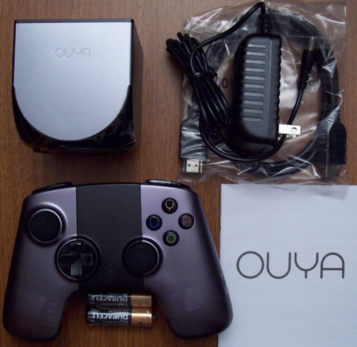
OUYA package contents

The first thing that surprised me was how small the console itself was; it literally fits in ones hand, and it is smaller than the controller in two of three dimensions.  I was also surprised, and delighted, to find that the box included an HDMI cable, a very nice touch that is usually overlooked (cynically: deliberately left out to make more retail profits).  Indeed, if one counted the retail prices of the controller, HDMI cable, and batteries, the console itself was quite inexpensive indeed. 🙂

Finally, the time came to set everything up, and I ran into my first issue.  Therefore, I will start with the (few) cons that I experienced.  The OUYA is a bit short on traditional documentation, so there is nothing explaining how to install the batteries in the console!  I challenged our local console expert, and he was unable to figure it out, either.  (A Google search reveals that we were hardly unique in our confusion.)  Also, after a bit of use, it becomes clear that the OUYA has no ventilation to speak of, so it becomes a rather effective hand warmer in a chilly office, but this will likely be a liability in summer.  Returning to the initial complaint, it turns out that the black area in the middle of the controller is a touch pad (!), which fact I did not discover on my own.

On the other hand, there were more important pros.  The installation process, including the downloading of a system update right away, was embarrassingly simple, especially when compared to the PS3, as well as humorous (even in the license agreement).  The display is extremely clear, even on my poor 720p office/development television.  The whole interface is straightforward and easy to understand, and the purchase process is just about as painless as it could possibly be.  The controller (contrary to some opinions) is solid and comfortable to use, and, of course, this whole system was inexpensive.

The available game software is certainly the most fundamental aspect of a console, and unsurprisingly, this is a bit of a mixed bag, at least in my limited experience (so far).  You have top games, such The Cave (currently #1), which delivers everything that one would expect, and others, like Amazing Frog? The Hopping Dead (#3), which seems to have come up a few weeks short of prime time.  I really wanted Pinball Arcade to be as good as their attention to detail, but alas, the delay between clicking a controller button and the flipper reaction makes the game totally unplayable.  Conversely, and promisingly, the OUYA version of Galaxoid, by lone developer Jacob Davis, is loads of fun (for just a few bucks).  This variety makes the ability to try games that much more valuable.

The next step is development.  Though I spent a little time playing with the OUYA as a consumer would, I have been too busy with paying work to install the ODK (OUYA Development Kit) and build anything for this new console.  You can be sure that I will post more about the OUYA after that happens.