Digital Gamecraft 2020

It has been just more than a year since SophSoft, Incorporated lost its second founding partner (of three) and I lost my wife of 31 years.  In a week, the company will be celebrating its 38th anniversary, and it will continue to develop game software.

During 2019, I took time to reflect on what was really important and what I wanted to do with the rest of my life, and I decided that the plans that Sherry, Rick, and I had devised (and undertaken) as business partners were honest and true representations of what we wanted to achieve.  Therefore, I will continue those pursuits, not just out of a sense of loyalty, but because they are why we got into this venture in the first place.

Digital Gamecraft will continue to develop and publish game titles in a variety of genres, and this will be our primary focus.  While some of these games may be a little different to what they would have been with my partners to help guide the development, the games will nevertheless embody the spirits of Sherry and Rick to the best of my capabilities.

SophSoft will also continue to do consulting work; however, due to sheer limitations of time, our regular client roster is effectively full.  Please feel free to contact us if you are in desperate straits or need our help with a fully-funded project that is right down our alley, but realize that we may not be able to fit you into the schedule.  (If you have just an idea, a shoestring budget, or a need for fleet management software, go somewhere else.)

We also have a couple of adjunct projects that I expect to see the full light of day within 2020; announcements will be made here as and when appropriate.

In an industry where companies come and go with a disturbing regularity, remember that we have had the same address for 30 years:

Post Office Box 4936
East Lansing, MI  48826-4936

We have had the same business phone number for 25 years:

(517) 337-3905

Our web site has also been in steady operation since 1995 (though this blog is just a baby at a mere 15 years old).  Plus, having been originally founded in 1982…

We are the oldest independent video game company in the world.

I truly appreciate your support as we continue to move forward.

Sincerely,
Gregg Seelhoff

RIP: Sherry Seelhoff (1964-2019)

Sherry Seelhoff

At the start of the year, my wife died unexpectedly at the age of 54.  We had been married for more than 31 years and have two wonderful sons.  Sherry was a founding member of SophSoft, Incorporated, and her passing has had a profound impact on me personally and will have a lasting effect on the company, including this blog.

Sherry was a dedicated and loving wife and mother, who gave herself fully to her family and friends. Her kindness and generosity touched everyone she met, leading to recognition for her service with volunteer organizations. She was loving and loved, and her memory will be carried by all she knew.

Sherry passed away quietly and unexpectedly in her sleep as the new year began. She is survived by her husband of 31 years, Gregg Seelhoff, sons James Seelhoff (Meredith Baumann) and William Seelhoff-Ely (Sandy Seelhoff-Ely), sister Melissa Short, mother-in-law Margot Hellerman (Lance Hellerman), sister-in-law Lori Seelhoff, niece Heather Joswik, half-sisters-in-law Angelina Hellerman and Andrea Hellerman (Jim Arnold), half-brother-in-law Samuel Hellerman, two half-nieces, one half-nephew, and innumerable friends. She was preceded in death by her mother, Mary Theresa Short, her father Wyman Richard Short, and her father-in-law, Gerald Norman Seelhoff.

Sherry lived her life with empathy and passion, and had an infectious spirit. She enjoyed hiking, camping, canoeing, dancing, reading, hosting game nights, playing trivia, watching movies, and listening to music. She loved laughing with friends and family. She would want to be remembered by those she loved continuing to participate in her favorite activities and striving for the ideals and compassionate causes in which she believed.

In lieu of flowers, the family requests donations in Sherry’s name to Sierra Club, ACLU of Michigan, and/or Planned Parenthood.

“… our life is as meaningful, as full and as wonderful as we choose to make it. And we can make it very wonderful indeed.” ― Richard Dawkins

“Don’t think of it as dying. Just think of it as leaving early to avoid the rush.” ― Terry Pratchett

“Don’t cry because it’s over, smile because it happened.” ― Dr. Seuss


Still Coding After All These Years

Today is my 40th anniversary of programming a computer.

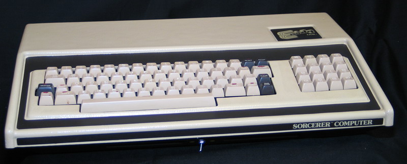
December 22, 1978: This day marked the first time I walked into a computer store, the first time I played a game on a home computer (or even touched one), and the very first time I wrote a computer program.

Exidy Sourcerer

Of course, that very first program was pretty BASIC. 😉  I learned the concept of programming, line numbers, how to RUN and LIST a program, and (at least) my first two commands, PRINT and GOTO, on that same day.

The very next day, I learned (more) about variables, FOR loops, and number theory (mathematics, not programming), as I helped an MSU student debug his program, and then further experiment with it.  We noticed that abundant numbers are often bounded on each side by primes, but this is not universal.

I urge you to read more about My First Programming Experience.

Computers were awesome!

A few years later, as I was on an airline flight, I took out my pen and paper and started writing a wishlist for the “perfect computer” for me, dreaming about what could be possible in the future.  I envisioned lots of colors, crazy amounts of memory (like 64K!), and larger custom character sets, which idea gave way to (really out there) thoughts of individually addressable pixels at very high resolution (say, 640×400).  At a conference, I saw a display with a “true color” screen image of an apple (fruit) at 1024×1024 and that blew my mind.

In the intervening years, I have had loads of milestones and accomplishments:

  • January 13, 1982: founded Sophisticated Software Systems
  • Summer 1982: had first professional programming job
  • Late summer 1982: purchased very first computer, a Commodore VIC-20
  • 1984: won the ComCon ’84 International Programming Competition
  • 1984: started first full-time programming job with Michigan State University
  • 1988: landed game programming job with Quest Software
  • 1989: published first retail game product, Legacy of the Ancients
  • April 22, 1990: self-published shareware game, Pacmania 1.10
  • February 1, 1993: started as Senior Software Engineer at Spectrum Holobyte
  • 1994: went full-time as an independent game developer
  • 1995: incorporated business as SophSoft, Incorporated
  • 1996: launched Digital Gamecraft for developing independent games
  • 2002: Goodsol Development released Pretty Good MahJongg
  • 2004: served as Chairman for the Association of Software Professionals
  • 2007: created first Mac game, Pretty Good Solitaire Mac Edition
  • March 27, 2013: A Little Solitaire became the #1 card game for iPad
  • 2013: published first Digital Gamecraft title for iOS, Demolish! Pairs
  • 2016: established and ran Advanced Concepts Group at DAQRI
  • 2018: published an Android version of Demolish! Pairs

These are just a few of the major highlights, but none of these events made as much of a difference in my life as that day I walked into New Dimensions in Computing.  Of course, there are a few personal milestones that really affected things as well, but most of these also happened within this time frame (more than 76% of my lifetime).

Today, I am back doing what I love: programming.  Even when things are tough, I truly enjoy the development process and can get ‘in the zone’.  When people would ask me what my favorite game was, I would often reply something like, “C++”. 🙂

Amazingly, I now have a stable of portable devices, each of which far exceeds my ultimate imagination for my perfect computer, and many of them blow away the visual capabilities of that screen that mesmerized me back in the early 1980s (and I never even considered the possibility of 3D rendering capabilities).  My phone fits in my pocket yet is more powerful than my first PC, and my watch is more powerful than that first computer.

Computers are awesome!


Meaningful Play 2018: Day 3

Saturday was the final day of the best conference on meaningful gameplay.

This shorter day ends the Meaningful Play 2018 conference.  As always, I leave with inspiration and a greater sense of purpose, not to mention hope.

Saturday morning keynote

The day began with a very informative and practical talk, The Promise of Games for Personlized Learning, in which Diana Hughes of Age of Learning discussed and demonstrated practices they used in ABCmouse Mastering Math to teach and assess mathematics skills in children ages 4-8.

One fundamental takeaway from the keynote was the importance of providing proper understanding (mastery) of basic mathematical principles (of which I had not realized there were so many) before attempting to teach a skill that relies on those principles.  The software uses various (positive) “scaffolding” for supporting a learner who does not demonstrate knowledge of a topic, as measured by incorrect answers in a game.

Initial results of scientific testing show great promise, based on significant improvements with just limited classroom time spent using the game, as well as anecdotal evidence from teachers that the software is effective.  I believe that numerical understanding is as important as the ability to read for educational success, so these are hopeful results.

Breakout sessions

There were only two breakout sessions on this final day.  For the first one, I attended Game Post-Mortem Microtalks II.

The first (of 3) games featured was a VR simulation of a Brazilian chicken farm.  Pericles Gomes presented the software running on Google Cardboard, along with some detailed information about the huge quantity of meat produced and exported from Brazil, and more detailed information about the number of chickens produced from the particular farm that was captured with 360 degree cameras to make the simulation.  Even running in just Cardboard, the VR version had proven more effective than the tablet version.

The second postmortem was from Phillip Cameron about the use of games with students learning the German language.  He presented the results of a limited survey of potential students and how likely they would be to continue with advanced German studies, and then again with similar classes using games and software.  The total numbers showed a slight improvement, but upon correlating answers between the two questions, it was shown that some “likely” to continue initially actually became “unlikely” in the class with games, while other moved from “unlikely” or “unsure” to “likely”.

The third and final postmortem was by Mars Ashton, who is very active in the Michigan game development community, on his award-winning game project, Axis Descending.  He discussed the personal origin of the project about a decade ago, its creation in Flash, the marketing and reception (including awards) of the project during development, and the ultimate decision to cancel the project.  Mars was very upfront about how his focus on the game had become “unhealthy” and how that affected him and those around him.

For the second breakout session, I chose to do the Tour of MSU Libraries Rovi Game Collection.  We walked to the MSU Library and, first, visited the Video Game Lab which houses the Rovi Game Collection, a collection of approximately 18,000 PC and console games dating back to the early 1990s (including at least 7 games I worked on 😉 ).

We then walked downstairs to visit the Digital Scholarship Lab, which is an impressive collection of technology available to students, faculty, researchers, and the public at large.  It includes a 360-degree visualization room, with seamless video projected on the walls of the round room, a VR room with Oculus Rift and HTC Vive set up and ready for use, a room with scanners, including a small 3D scanner, and numerous very powerful desktop computers with just about all the creation and development software one could want.

On the way out, we also passed the MakeCentral Makerspace, which has 3D printing, structure scanning, laser cutting, and vinyl cutting available, as well as a technology lending program with a number of digital toys…  I mean, toolsVery cool.

Saturday afternoon keynote

The closing keynote was Imagineers at Play, by Bei Yang of Walt Disney Imagineering.  He discussed several aspects of “imagineering”, including the many disciplines involved, how they test and revise experiences, and the benefits of using BIM (Building Information Modeling) for design of spaces.  He then showed a number of projects, ranging from experimentation to final implementation, to illustrate the ideas.  This included the revelation that an upcoming Disney experience will allow guests to pilot the Millennium Falcon!

The key takeaways were that the design loop (ideate, prototype, test) is essentially the scientific method (hypothesis, experiment, conclusion) in practice, and the following observations on technology:

  1. Everything is design
  2. Technology is making design loops faster
  3. Technology is changing what we can do in those designs

Coincidentally, I ended up asking the last public question of the conference, which was (from memory): For new experiences, does the storytelling drive the technology, or does the technology drive the storytelling?  The short answer was, “Both.”  The longer answer was that sometimes there is a story to tell and they seek out the best technology to do that, which sometime results in ideas being shelved, and other times advances in technology make it possible to tell a story that had been ruled out in the past.

Conclusion

I leave this awesome conference full of new ideas, as well as with a couple new goals to be completed before Meaningful Play 2020.


Meaningful Play 2018: Day 2

The second (and last) full day of this conference is a go.

This is the last full day of the Meaningful Play 2018 conference on serious games, games with a meaningful purpose.  The conference has been quite inspiring so far.

Friday morning keynote

The day got off to a great start with Six Observations on Failure that May or May Not Relate to Games by John Sharp from the Parsons School of Design at The New School.  In this talk, he discussed the benefits of failure, repeatedly invoking the phrase “fail better”, which is part of a quote he (reportedly) has tattooed on himself, while also acknowledging that not everybody has the ability to fail in all circumstances.

The presentation surveyed a number of different ways to see failure as a springboard for better results in the future, including advice from books going back to the mid-1800s, but noted how current American society (especially sports) paint failure as a bad thing.

The key takeaway was the simple process presented for better failure:

  1. Detect
  2. Acknowledge (the hardest part)
  3. Analyze
  4. Attribute responsibility (n.b., not blame)

He encouraged everybody who is in a position to afford it to fail often and fail better.

My personal observations, complementing not contradicting his, are that failure leads to better retention of correct results (i.e., learning) and that the fear of failure results in not trying things, for one, but also in striving for perfection, which in turn results in analysis paralysis and perfectionism.  A quote from a friend that hangs on my office wall reads, “Done is better than perfect.”  (I write this to remind myself again. 🙂 )

Breakout sessions

Instead of a midday keynote, Friday has three breakout sessions of six options each.  For the first one, I instead attended the Tower Room (or, more accurately, the hallway outside) to work on these blog updates (and also charge the tablet) before lunch.

For the second breakout session, I attended The Original Mobile Games: Recreating Historic Dexterity Puzzle Games for Digital Mobile Platforms, a talk by Stephen Jacobs from The Strong National Museum of Play as well as RIT, both of which organizations collaborated on the development of the digital game at the heart of this presentation.

Although this may just be my particular proclivity, but this talk was the one that I found to be the most exciting of the conference (to this point).  This is probably because of my strong interest in the history of traditional games and the fact that my primary development focus is casual games; I even have a game with related mechanics in the project queue.  The turnout was a little disappointing, but seeing both Noah Falstein and John Sharp (and, of course, Stephen Jacobs) there provides support for my choice. 😉

The discussion was about the history of “dexterity puzzle games” (i.e., the original mobile games) such as Pigs in Clover (as seen in the image), in which the aim is to use physics to maneuver objects, usually balls, into indentations or positions as prescribed by the rules.  These have been popular for 129 years, and the Strong Museum has around one hundred examples of the game type.  This product attempts to replicate the physics behavior of some of these games, as well as preserving the history, appearance, and even sounds of these early amusements, making it all accessible on mobile devices.

I am excited just to see this project, even if I do not end up playing it much.  You can get it now for Android on Google Play or for iOS on the App Store, and you can check The Original Mobile Games website for to check for other platforms in the future.

For the third breakout session, I attended Game Post-Mortem Microtalks I.

The first (of two) games featured was Plunder Panic, a game created by Brian Winn, William Jeffery, and 12 (paid) student developers from MSU.  This is an award-winning game with simultaneous play for up to 12 players, and one of the first university games to seek a retail audience, which provides extra challenges beyond merely development.  The primarily development challenge was productivity from college students during the school year, but the game presses forward, scheduled to be released commercially in 2019.

The second featured game was Thunderbird Strike, a game from Elizabeth LaPensée, who did the design and hand-drawn artwork.  The postmortem did not discuss much about the development, per se, except that the animations had to be reduced because of the time required to do animations by hand, one frame at a time.  The bulk of the discussion was about how this small indie art game, made by indigenous people, for the purpose of reflecting some indigenous culture and values (for a small audience), became the focus of a political firestorm, which thrust the game into the public eye to a much wider audience, but also brought about unfair and inaccurate criticism of the game and personal attacks directed towards its designer, whose life was altered by the controversy.

Friday afternoon keynote

The afternoon keynote was Playful Social Engineering by Katherine Isbister of University of California, Santa Cruz.  The talk began with discussion about the way technology tends to separate us “cyborgs”, such as when people are so engaged in their phones that they eschew normal social interaction.  The presenter then discussed issues of and opportunities for using technology to encourage, rather than interfere with, social interconnection, then showed a couple of case studies with LARPs (Live-Action Role Playing games).  More research and work needs to be done in this area.

Game exhibitions

Thursday night had the Conference Reception, Game Exhibition, and Poster Session, which included (among other things) demonstrations of serious games.  Friday night featured the Pure Michigan Game Exhibition and Celebration, which showcased many games made in Michigan.

[I will discuss these events in a separate post later.]

Meaningful Play 2018: Day 1

The first full day of the conference is a rollicking start.

Meaningful Play 2018 is properly and officially underway with the opening remarks (following Meaningful Play 2018: Day 0) by conference chair Brian Winn, who has organized the biennial event since the first in 2008.  The theme this year is wizards (after ninjas, monsters, and robots) and the slogan is, “Exploring the Magic of Games.

The purpose of the conference is to bring together game developers and academics to discuss the research and practice of designing serious games, which are (to give a simpler definition than yesterday) games with meaning.  This thread of exploring not only the magic but the purposeful impact of games runs through the proceedings.

Thursday morning keynote

The morning keynote was Three Miles An Hour: Designing Games for the Speed of Thought, by Tracy Fullerton, game designer and Director of the Games Program at USC.  The “three miles an hour” from the title refers to average walking speed, which has been suggested as a pace at which thinking can occur more readily, and Tracy explores this concept in “walking simulator” games such as her own Walden, a Game.  She discusses the idea that games can (should?) have “reflective play”, where scenes with no urgent interactivity can be used to give the player a chance to reflect on the experience.

One takeaway was the proposed reshaping of Sid Meier‘s definition of a game as “a series of interesting choices” into “a series of meaningful situations“.  It is an interesting reframing, but I feel that the two are fully compatible; what makes a decision interesting is anticipation of a meaningful situation to which it leads.  It is analogous to traditional games: some games play on the points on the board, while others play on the polygons they form.

The important thing here, I think, is the word, “meaningful“.

Morning session

The morning breakout session provided six options for talks, papers, panels, and workshops, but since I can only be in one place at a time, I choice to attend Physics is (still) Your Friend: The World of Goo @ 10 by Drew Davidson.  In this talk, he revisited the talk he gave at Meaningful Play 2008, looking at how The World of Goo stands up after 10 years on the market (answer: quite well) and even revealed a few spoilers for those of us who never got very far in the game.

Key takeaways were that the game was, in a way, a metaphor for the indie game development process (full analysis would be too deep for this post), that early figures showed that 90% of players of the game were pirating it but they were successful despite that by focusing on the game, and that they produced the game for many platforms and continue to upgrade them to remain playable through the years.

Midday keynote

Full disclosure: Living near to the conference venue has a few drawbacks such as, perhaps, getting pulled away from the event for family matters, so I missed the first 15 minutes of this keynote, Games Are Not Good for You, by Eric Zimmerman.  This means that I missed the audience playing “Five Fingers” and, apparently, a swipe at Luminosity.

Nevertheless, even sans introduction (and title slide picture), this talk was enlightening about the practice of informed game design.  The most fascinating part of the talk, to me, was a discussion of his game, Waiting Rooms, which was a building-sized installation wherein players would walk around collecting and paying pennies and tickets according the rules of various rooms.  They set up systems without a defined goal and observed what was essentially (although I did not hear him call it this) emergent behavior, but driven by human desires and values rather than programmed operators.  (Here is the first article about the game that came up from a Google search.)

Afternoon session

For the afternoon sessions, I chose (from six options again) to attend a talk, An Innovative Approach to Collaborative Game Design, given by Carrie Cole and Sarah Buchan of Age of Learning.  This was the most informative session yet, with practical information and clear illustration of how the learning process was advanced and how curriculum and game design are balanced to achieve those goals.  It was very worthwhile.

In a weird twist, I discovered that Carrie, who I met here in East Lansing when she was at MSU, ended up moving out to the Los Angeles area just a few months after I did, and without realizing the connection at the time, I found out about Age of Learning when we interviewed and ultimately hired one of their developers for my team at Daqri.

Afternoon keynote

The afternoon keynote was Moments (formerly, Nuance) in the Woods: Exploring Meaning in Games by Alec Holowka, one of the developers of Night in the Woods.  The game uses the tag line, “At the end of everything, hold on to anything.”  This line hints at the meaning that the game could and, as we heard, does have.

This talk turned out to be (perhaps unexpectedly) the highlight of the conference so far. After some introduction to the game, which appears to be very engaging, including the incorporation of reflective play opportunities, with a character-driven story.  There was also discussion about some of the development process, the successful KickStarter campaign, and various mistakes made along the way.

The presentation was interesting to that point, but then the speaker took a turn into his own personal struggles while creating the product, concluding that portion with a realization that not everybody has the same access to health care and support services, and how their game could been meaningful to people (especially young people) facing similar struggles.  Then, he read some quick highlights of testimonials from affected players and showed lots of fan art demonstrating the degree to which the game made the desired connection with players.  It was moving and enlightening.

One key moment was the showing of this animated tribute video [2:06] created over the course of a year by a 16-year-old girl, Sarah Y., who ends the video with the message “thank you for inspiring me and many others”.  It was amazing.


Meaningful Play 2018: Day 0

This conference on serious games got underway Wednesday.

Meaningful Play 2018 started here in East Lansing, on the campus of Michigan State University, with a special talk given by game design luminary, Noah Falstein.

The Surprising Synergy of Medicine, Games, and VR was actually a crossover talk, serving as the last presentation of the single day AR/VR Symposium at MSU and launching Meaningful Play 2018, a leading conference on serious games, which are games that explicitly provide an additional benefit beyond entertainment, such as education, training, advocacy, or (as in this case) health care.

In this talk, Noah spoke about the potential for VR (virtual reality) to make a strong emotional connection, and the challenges presented using VR for medical games, specifically the issues (good and bad) with advancing technology.  He transitioned to health care by discussing a pain control study where a child was distracted from a painful medical procedure (changing burn dressings) through a VR game, reducing anxiety and the need for sedatives.

His three top arguments for considering games for medical purposes:

  1. Helping people
  2. Challenging, exciting, and diverse development
  3. Big market (especially with FDA clearance)

In support of the latter argument (as the first two are fairly self-explanatory), he mentioned that the pharmaceutical industry, just in the United States, has an annual turnover of 300 to 400 billion dollars.  If therapeutic games could capture just 5% of that market, it would be close to the total value of the (entertainment) video game market.  Food for thought.

Finally, Noah presented some quick case studies of companies/products that were having success in this field, including Akili Interactive, MindMaze/MindMotion, and Muse.  It looks like a very interesting field, with funding available for successful ventures (albeit likely outside the reach of my micro-ISV).

Warm Up

This is my first proper conference in 4 years (since the 2014 edition of this same conference) and it is really convenient that it is held right here in my hometown.  It is quite nice not having to worry about the expense and logistics of lodging.  It has always been good to be able to actually walk to the venue in the past, too, but this time it started raining right as I left home, so I was damp when I arrived for the talk.  Worse, the rain picked up on the way back, so I was totally drenched by the time I got back.

Being that I have been slightly out of the loop for a while, it was really comforting to have the elevator doors open to reveal just two people already in there, the aforementioned  Noah Falstein, who I knew back in the day (but have not seen in person in 15-20 years), and Patrick Shaw of Stardock, who I know better and have seen much more recently.

This was a great way to ease into the conference.

Launch Screen Sizes for iOS 12

If you still use launch screens, these are the sizes you need.

As with mobile icons, the proliferation of new Apple mobile devices demands an ever increasing number of launch images.  This post lists the necessary artwork sizes to directly support all devices (and possible orientations) as of iOS 12.

Of course, Apple realizes that adding new launch screen sizes every time they introduce a new form factor will quickly become unsustainable.  (It is close to that now; otherwise, this post would be unnecessary. 😉 )  For that reason, they introduced launch storyboards, which allow a launch screen to be defined by a layout of controls and constraints, rather than by individually sized images.  The only problem is that, unlike normal storyboards, the launch storyboard is loaded before the application runs, so only automatic layout can occur; no code can be executed.  Therefore, customization is restricted, which prevents developers from accomplishing the same thing that is possible with launch images, namely, use of the entire screen on each individual device for displaying an image.

Apple takes the position that the launch screen should display an image reflective of the first screen of the application to give the impression that the app has launched that quickly.  This certainly is better for Apple, who is not known for missing branding opportunities, but using the launch images for branding, i.e., a splash screen, is expected in the game industry (and, arguably, for any software).  Also, games usually have custom background artwork, and if that is customized to screen sizes, there is no easy way to mimic that with a launch storyboard, at least at the moment.

To be fair, nowadays the launch screen is a somewhat rare occurrence, as it is only shown at first launch, or when the application has been unloaded, either closed by the user or removed from the background by the system to recover resources.  If you design your splash screen to be an image in a sea of solid color or a repeating texture, you can reproduce that with a launch storyboard.  The kind of splash screens that Rick Tumanis designed for Demolish! Pairs or Pretty Good Solitaire, however, do not lend themselves to this approach.  It is for that reason that we still use launch images in those games (and others).  In fact, Demolish! Pairs will reshow the splash screen if you shake the device from the menu.  (It is an ‘undo’ when done from within a game.)

So without further ado…

iPhone Launch Screen Sizes

Apple iPhones provide the bulk of the variety in device screen sizes, so you need to provide 11 (or 12) launch images for full coverage, as follows:

  • Portrait iOS 12+
    1. 1242 x 2688 (@3x) – iPhone XS Max
    2. 828 x 1792 (@2x) – iPhone XR
  • Landscape iOS 12+
    1. 2688 x 1242 (@3x) – iPhone XS Max
    2. 1792 x 828 (@2x) – iPhone XR
  • Portrait iOS 11+
    1. 1125 x 2436 (@3x) – iPhone X / iPhone XS
  • Landscape iOS 11+
    1. 2436 x 1125 (@3x) – iPhone X / iPhone XS
  • iPhone Portrait iOS 8+
    1. 1242 x 2208 (@3x) – Retina HD 5.5″ (iPhone 6 Plus / 6s Plus / 7 Plus / 8 Plus)
    2. 750 x 1334 (@2x) – Retina HD 4.7″ (iPhone 6 / 6s / 7 / 8)
  • iPhone Landscape iOS 8+
    1. 2208 x 1242 (@3x) – Retina HD 5.5″ (iPhone 6 Plus / 6s Plus / 7 Plus / 8 Plus)
  • iPhone Portrait iOS 7+
    1. 640 x 960 (@2x) – 2x (iPhone 4s)
    2. 640 x 1136 (@2x) – Retina 4 (iPhone 5 / 5s / SE)
  • iPhone Portrait iOS 5, 6 (legacy)
    1. 320 x 640 – 1x (optional – unused on iOS 8+)
    2. 640 x 960 (@2x) – 2x (same as #10)
    3. 640 x 1136 (@2x) – Retina 4 (same as #11)

Note that the lowest supported target system for Xcode 10.0 (latest version as of this writing) is iOS 8.0, and no devices at the original iPhone resolution (320 x 640) can run that version of iOS, so the final unique size (#12) is unused in modern apps.

iPad Launch Screen Sizes

There is good news and bad news when it comes to supporting iPad launch images.

Good News

The good news is that you only need 4 launch images for iPad support, as follows:

  • iPad Portrait iOS 7+
    1. 768 x 1024 – 1x (iPad 2)
    2. 1536 x 2048 (@2x) – 2x (iPad Retina / Air / Air 2 / 5th gen / 6th gen)
  • iPad Landscape iOS 7+
    1. 1024 x 768 – 1x (iPad 2)
    2. 2048 x 1536 (@2x) – 2x (iPad Retina / Air / Air 2 / 5th gen / 6th gen)

That is pretty straightforward, especially given that they are the same aspect ratio, so you can just create the double density size and directly reduce the image.  Further, if your target platform is iOS 10 or higher, the iPad 2 is no longer supported, so you only need the two larger images for all remaining iPads.

For completeness, here are the legacy sizes for iPads running iOS 5 or 6:

  • iPad Portrait Without Status Bar iOS 5, 6 (legacy)
    1. 768 x 1004 – 1x (optional – unused on iOS 8+)
    2. 536 x 2008 (@2x) – 2x (optional – unused on iOS 8+)
  • iPad Portrait iOS 5, 6 (legacy)
    1. 768 x 1024 – 1x (same as #1)
    2. 1536 x 2048 (@2x) – 2x (same as #2)
  • iPad Landscape Without Status Bar iOS 5, 6 (legacy)
    1. 1024 x 748 – 1x (optional – unused on iOS 8+)
    2. 2048 x 1496 (@2x) – 2x (optional – unused on iOS 8+)
  • iPad Landscape iOS 5, 6 (legacy)
    1. 1024 x 768 – 1x (same as #3)
    2. 2048 x 1536 (@2x) – 2x (same as #4)

The only (4) new sizes here are just the same launch screen sizes with an area for the status bar (20 or 40 pixels) removed.  These sizes are never used in modern apps.

Bad News

The bad news is that, as keen observers will have noticed, I did not list any of the iPad Pro models above; this is because an iPad Pro acts like an iPad Retina.  Without a launch storyboard, all iPad Pro devices show up as though they are only 2048 x 1536 resolution.

To be fair, the smallest iPad Pro, the 9.7″ model, is only 2048 x 1536, but the two larger models have higher resolution that is not used: 12.9″ is 2732 x 2048; 10.5″ is 2224 x 1668.

If you want to have the full resolution of iPad Pro devices, you must use a launch storyboard rather than launch images; you cannot use both, as (experimentation suggests that) the inclusion of a launch storyboard supersedes launch images.  Damn.

Conclusion

The release of iOS 12 added the need for 4 additional launch screens (to support both orientations for the iPhone XR and iPhone XS Max), so a “universal” app needs to provide a total of 15 launch images to support all iPhone and iPad devices.  However, if your game or app needs to take advantage of the full resolution of the iPad Pro, you will need to provide a launch storyboard instead, and adjust your launch screen appropriately.

All Apple needs to do to provide complete support is to provide constraints for individual form factors, allowing different images to be selected from the launch storyboard based on device model, OR use a provided launch image in preference to (or prior to) a launch storyboard.  Best of all, they could just remove the arbitrary and silly restriction that prevents access to full iPad Pro resolution unless we provide a launch storyboard, which restriction seems to be in place for the sole purpose of strong-arming developers into supporting launch storyboards (before they provide equivalent functionality).

In the meantime (which will likely be forever), it makes sense to start figuring out how to adjust your launch design and strategy to work with launch storyboards.  This is not unlike what is currently necessary for Android support, anyway.  For our next project, we are investigating a high resolution square-ish logo that can be the sole image in a field of white, scaled to largest size possible to fit the launch screen.

Abandoning this expected branding opportunity, though?  Not likely.

Modern Mobile Icon Sizes

Icon sizes you need to support iOS 12 and Android Oreo devices.

With the explosion of mobile devices, it keeps getting more difficult to keep track of the myriad icon sizes required for mobile apps.  This post simply lists the required sizes and uses for iOS and Android devices (as of now).

When creating an application icon, it is best to start with an image that is (at least) the size of the largest icon necessary, which is currently 1024 x 1024, and then reduce that image to the necessary sizes, reducing level of detail as/if necessary for smaller icons.

iOS App Icons

As of Xcode 10 (iOS 12), iOSApple iOS devices have application icons for the app on three different device types (iPhone, iPad, and iPad Pro), the store, spotlight (search), settings, and notifications, and these icons may need to be provided in single (unadorned), double (“@2x”), or triple (“@3x”) scale factors.

For a “universal” app, you need to provide icons in 13 resolutions (for 15/18/19 different uses, depending on how you count).  iPhone only apps need 8 resolutions; iPad only apps need 9 resolutions.

Here is a list of the iOS icon sizes, along with a color-coded list of the uses:

  • 1024 x 1024
    • App Store – all applications  (<title>.png)
  • 180 x 180
    • iPhone application @3x  (<title>_iphone@3x.png)
  • 167 x 167
    • iPad Pro application @2x  (<title>_pro@2x.png)
  • 152 x 152
    • iPad application @2x  (<title>_ipad@2x.png)
  • 120 x 120
    • iPhone application @2x  (<title>_iphone@2x.png)
    • iPhone spotlight @3x  (<title>_search@3x.png)
  • 87 x 87
    • iPhone settings @3x  (<title>_settings@3x.png)
  • 80 x 80
    • iPhone spotlight @2x  (<title>_search@2x.png)
    • iPad spotlight @2x  (<title>_search@2x.png)
  • 76 x 76
    • iPad application  (<title>_ipad.png)
  • 60 x 60
    • iPhone notification @3x  (<title>_notify@3x.png)
  • 58 x 58
    • iPhone settings @2x  (<title>_settings@2x.png)
    • iPad settings @2x  (<title>_settings@2x.png)
  • 40×40
    • iPad spotlight  (<title>_search.png)
    • iPhone notification @2x  (<title>_notify@2x.png)
    • iPad notification @2x  (<title>_notify@2x.png)
  • 29 x 29
    • iPad settings  (<title>_settings.png)
  • 20 x 20
    • iPad notification  (<title>_notify.png)

Android App Icons

AndroidAndroid icon requirements had remained fairly consistent, but as of Android 8.0 (Oreo, API 26), those application icons are now classified as “legacy”, though still required for support on earlier devices (i.e., 85.4% of the market); the latest devices can use “adaptive” icons.  All applications should have a store icon.

For most Android apps, you should provide application icons in 6-8 resolutions (none of which overlap with the iOS resolutions).

Store Icon

Android apps, if they are to be published, require a store icon:

  • 512 x 512 – Google Play

Legacy Icons

To support devices running Android 7.1 (Nougat, API 25) and earlier, which you absolutely should, provide legacy icons in resolutions supporting 5 (or 6) different screen densities:

  • 192 x 192 – xxxhdpi
  • 144 x 144 – xxhdpi
  • 96 x 96 – xhdpi
  • 72 x 72 – hdpi
  • 48 x 48 – mdpi
  • 36 x 36 – ldpi (optional)

Note that some legacy icons can (technically) be omitted, but those sizes will be generated by the Android system from other sizes, and not necessarily the best resolution (i.e., a larger icon may be generated from a lower resolution icon, which looks poor).  Therefore, only the low density (ldpi) icon is considered optional; no modern devices are low density, and if one was it would necessarily generate the icon from a larger source.

Adaptive Icons

Adaptive icons were introduced in Android Oreo to allow the system to perform visual effects with the shape and/or contents of an application icon.  In order for this to be supported, adaptive icons need to be separated into foreground and background layers; the foreground contains the important content of the icon, toward the center, and the background is an image or color that may provide branding but could be clipped.

These are the components:

  • foreground – 108 x 108 image with transparency, icon content in center 72 x 72
  • background – color or 108 x 108 image to be composited with foreground

The foreground and background may be moved or sized independently before being composited together, and the resulting image will likely be cropped into an arbitrary shape; Android reserves an 18 pixel border for these kind of visual effects.

For more information, see this page about supporting adaptive icons.

Conclusion

For a mobile app to support all recent iOS and Android phones and tablets, you will need to create about 20 icons, in the resolutions above, including separate foreground and background layers for adaptive icon support.  If possible, start by creating an App Store icon (1024 x 1024) from a separate foreground and background.  Use that as a source icon to generate the smaller Google Play, iOS, and Android legacy icons, adjusting detail as necessary.  Finally, resize the foreground and background layers appropriately to generate the components for the adaptive icons.  (Then, take a deep breath.)

Now you are ready to implement your application. 😉  Of course, if you want to support Android TV, Apple TV, Android Wear, Apple Watch, Android Auto, and/or Apple CarPlay…

Securing the Web

Adding SSL/HTTPS support to Apache.Digital Gamecraft logo

You may have noticed (or not) that this blog has recently acquired a little padlock icon to indicate that it is “secure”.  You can now access the blog using “https://”; in fact, using “http://” (without the ‘s’) just redirects to the secure page anyway.

Marketing Purpose

This change has been on the task list for a very long time, but it finally became really important when, last July, Google changed Chrome to display “Not secure” next to any web site that did not have a certificate.  Given that Chrome now represents about 60% of browser usage across all platforms, that is not an audience we would ignore. Fortunately, at the moment, the little indicator in Chrome, and other small reminders in various browsers, are not too damaging, but this is likely just the beginning of more and more dire warnings.  Realistically, there is essentially nothing passed from this blog outside of Digital Gamecraft itself that needs to be encrypted, per se, but readers do not necessarily know that, and they should not be asked to know that, either. From a marketing standpoint, anything that causes a “customer” (in this case, reader) to have to make a decision (e.g., “Is this site safe?“) reduces the likelihood that individual will continue, which means that it reduces the audience.  Not desirable.

Technical Purpose

In the past (i.e., when this task was first added to the web improvements list), adding support for secure, encrypted communication via SSL/TLS/HTTPS was a complicated and confusing process.  Frankly, this is why it never quite bubbled up to the top of the list and, thus, never got implemented until recently. Without getting too technical (because I could not, even if I wanted to), SSL stands for Secure Socket Layer, which is a protocol for encrypting communications, and TLS stands for Transport Layer Security, which is a newer version of the same thing.  TLS actually supersedes SSL, but the latter is still used generally to represent both SSL and TLS.  HTTPS is the protocol used to do the actual communication. The idea is that everything transmitted over the internet (such as this blog post), if not encrypted (i.e., using HTTP), is readable at every server and router along the way.  Encrypting the data makes this (nearly) impossible, so TLS (or SSL) is used, and HTTPS tells the receiving computer that the message needs to be decrypted.  The process of encrypting and decrypting data relies on certificates that need to be obtained from a certificate authority (CA), which is where things were most complicated. In the “old days” (just a few years ago), you would have to contact a CA to get a certificate, and this process often required providing lots of information to prove who you were before (always) paying an annual fee for a certificate.  There are different types of certificates with various levels of verification and you can still spend upwards of $500/year on a certificate, or even $150/year or so for certificates no better than certificates you can get for free.

Implementation

You read me correctly: FREE.  Over the past few years, the cost of low-end certificates (enough to be considered “secure”) has dropped to the point of now being free and automated.  In particular, Let’s Encrypt is a certificate authority “run for the public’s benefit” that provides free certificates. Additionally, the automation provided by Let’s Encrypt and EFF’s Certbot makes this fairly simple to do.  After the fact, knowing how easy this was, I am somewhat embarrassed that I did not do it sooner.  So, here is how I did it… I started at the Let’s Encrypt site, read a little bit, and then was directed to the Certbot site, which (on the main page) just asks for your web server and system type.  Caveat: We run our own servers here, so I have full shell access to the system; I do not know how much more difficult it may be trying to do this through a web interface. Because we are using Apache running on Ubuntu (Xenial) to serve this site, I ended up on this Certbot page.  First, I updated my system, just to start with the latest components, and then I just followed the (5) steps in the Install section.  If you have ever installed Linux software from a command line, the process should seem quite familiar. Next, I typed in the first command under Get Started:
sudo certbot --apache
I answered the few questions (asked only once) about, as I recall, contact information and whether I wanted to be added to the EFF mailing list (emphatically not).  The meat of the program produces a list of domains served by the Apache installation and allows you to select which ones you want to serve as HTTPS.  After that, it asks whether you want to redirect all HTTP traffic to HTTPS (recommended), which seems to be working flawlessly. In our case, we have quite a few domain and host names all serving one of a relatively small number of sites.  I initially did just one site (https://sophsoft.com), which worked a charm, but I ended up recreating that certificate and including all of the other host names that serve up the same pages (e.g., www.sophsoft.com and sophsoft.info).  I then repeated the process separately for each discrete site.  Voila!  Done. Actually, the installation process, when finished, gives you a link to SSL Labs testing page so you can verify the security of your page.  All of our pages were given Overall Rating: A. As noted in the Automating renewal section, the certificates are only good for 90 days (gift horse and all that), but it looks like there is a cron job that can be installed to automatically renew.  I admit that, until I started writing this paragraph, I thought that it had been installed already, but it looks like I will need to do that myself.

Final Adjustments

We did still have one or two pages (OK, the whole blog 🙁 ) that initially served up encrypted pages but still showed a broken padlock, indicating lack of security.  This can be caused by residual HTTP references in a page, which result in only portions of a page being secure.  Often, image links are still insecure, so they need to be fixed. In our case, the blog needed the canonical address to be updated to HTTPS in the settings, the custom theme had a reference to an image file accessed insecurely, and many of my actual blog posts made explicit HTTP image references.  It really only took a few minutes to find and fix the issues, but there was a little sleuthing involved.

Conclusion

Sooner or later, and I imagine sooner, web pages that are served up without encryption will be the outliers and will have an increasingly diminished reputation.  I would be quite surprised if Google’s search ranking algorithms did not already favor HTTPS pages.  Given that the cost has now dropped to nothing and automation makes the process pretty easy, it seems like an obvious improvement for any business that values its web presence.