Demolish! Pairs 1.0 for iOS

Our arcade/puzzle game has been released!

Digital Gamecraft has published Demolish! Pairs on the App Store, where you can now buy it for only $1.99 (for a limited time only).

Demolish! Pairs 1.0 for iOS
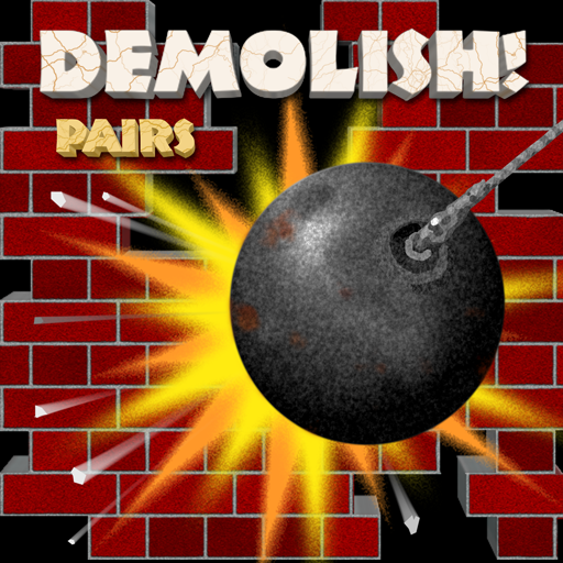
Demolish! Pairs represents a true milestone.  This is the first truly self-published title we have released in more than 23 years, and at the same time, it is the very last title on which we worked with our late friend and partner, Rick Tumanis, who did most of the artwork, and all of the sounds, for this game prior to his passing in 2011.

We are providing a limited number of free review copies to press (traditional or online) and, indeed, to the first three people who send an email to us at support@digitalgamecraft.com and tell us you read about Demolish! Pairs on this Gamecraft blog.  [Editor note: Press copies are still available, but the giveaway codes are gone.]

Please…  Download and Enjoy!Demolish! Pairs on the iOS App Store

Seeking a few great Beta Testers

We need people to playtest our arcade/puzzle game.

Demolish! Pairs for iOSToday, Digital Gamecraft is making an open call for iOS beta testers to help us test Demolish! Pairs in preparation for its upcoming release on the Apple App Store.

Anybody with an iPad, iPhone, or iPod touch is eligible to join our team and get early access to this fun game, while helping us make it as good and solid as possible.  All you have to do is play the game (and then tell us about it 🙂 ).

For more information, and to sign up, see our call for iOS beta testers on the Demolish! Pairs site.

DemolishPairs.com

The spiders already have it, so it is announced.

Demolish! PairsToday, we unofficially launch our brand new web site, DemolishPairs.com, in support of our upcoming release, Demolish! Pairs.

Demolish! Pairs is an arcade/puzzle game, initially for iPad, iPhone, and iPod touch, where players remove pairs of bricks (or other blocks) and attempt to entirely clear the grid for each level.  Players compete in either Arcade Mode or Zen Mode, depending whether they want a challenge against the clock or a more relaxing experience.

So just how new is the web site?  It is so new…  Only a couple of pages were published when Google stopped by and added it to their database (#1 for “Demolish Pairs”), caching the main page in the process.  Because of that unexpectedly accelerated schedule, the number of pages that are actually ready will depend on how quickly you visit the site. 🙂

iPhone screen shot of Demolish! Pairs

Demolish! Pairs on the original iPhone [8 x 5, 4 colors, ‘Brick’ block set, ‘Darkness’ background, toolbar hidden]

What I can say with some confidence is that there will be a call for beta testers within a few days.  In the meantime, if you have any comments about or suggestions for DemolishPairs.com, they will be greatly received at webmaster@digitalgamecraft.com.

Featured Tweet (#441)

Details: I dropped the iOS Deployment Target to 3.2, and the project built (seemingly) properly for all iPads, but Xcode 4.4.1 refused to actually send the app to the device.  It ran the existing (older) version on the device the first time, and when that was deleted manually, it threw error messages about not being able to find the file. (!)  Cleaning the project did not seem to work, but erasing the intermediates folder did the trick.

Where the Macgic Happens

A cozy Mac OS X and iOS development corner

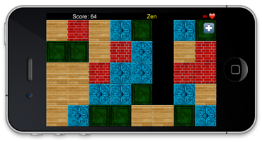
I thought I should give readers a little glimpse behind the curtain here at Digital Gamecraft, so here is a picture of my personal Apple technology desk on one of those unusual days during which a full complement of devices have gathered.  Usually, most of the mobile devices live in other places, but they occasionally come together for an ultra-local technology conference.  (In this case, they were all anxiously anticipating new provisioning profiles after the previous batch had expired.)
This desk in the corner of the office is used for the bulk of primary development and debugging for Mac OS X and iOS products.

Here you see a simple key to the components of this image.  First, the parts labeled in red are the development components:

  1. MacBook Pro (“late 2007”), 17-inch 2.4GHz, running Mac OS X 10.4 (Tiger) through Mac OS X 10.7 (Lion), and soon the developer preview of 10.8 (Mountain Lion), with the help of an external FireWire hard drive, mostly hidden from view by the next item.
  2. iPad (original) 16G running iOS 3.2, the minimum iPad platform supported by our products.
  3. iPod touch (2nd generation) 8G, running iOS 4.2.1, sans (unsupported) multitasking.
  4. iPhone 4 with 32G, running iOS 4.2.6, with multitasking, GPS, camera, and (most importantly) a Retina display.
  5. iPad 2 (Wi-Fi + 3G) with 64G, running iOS 4.3.5, named “Rabbit”.
  6. Mac Mini PPC running Mac OS X 10.4 (Tiger), the minimum Mac OS X platform supported by our software.
  7. Mag Innovision widescreen monitor with dual inputs, running natively at 1680 x 1050, acting as an external display for both Mac systems.
  8. Microsoft Mouse attached via Apple keyboard.  After a year of trying to keep this desk Apple-only, I had to surrender to the fact that Microsoft is just far better at making mouses.
  9. Herman Miller Aeron chair, brand new, also known as my horizontal trans-workstation transport device (for quickly moving between this workspace and my Windows workspace).  After breaking chairs every 2-3 years, the 12-year warranty actually made this purchase seem much more reasonable.

The components labeled in green in the key are fundamental to productivity, though not directly part of the development process:

  1. Head, the head head.  Head is responsible for employee morale, and keeping his minions in line.  (“I am so important that my minions have minions.”)
  2. Minions.  These (4) heads each have individual names, and they keep things lively by moving around the desk, often at night, very unlike their larger relatives.  You’ve heard of “talking heads”?  These are not those.
  3. Pioneer stereo receiver, practically an antique, from the days where radio was broadcast through the air.  This magic box plays news from NPR as well as classic rock and blues (and, previously, jazz), and special shows are regularly recorded digitally for later/repeat listening.  [Not shown: separate cassette player/recorder and turntable components.]

That is a small look at one corner of my office, which serves as an important piece of our development effort.  With this range of equipment, we can develop and test products for the last 4 major versions of Mac OS X, on both Intel and PPC hardware, as well as on versions of iOS since the iPad was introduced, with at least one device with each technology.  (Of course, things change again on Friday with the availability of “The new iPad” and its large 2048×1536 Retina display.)

Note that the view just to the left of this picture is out a window into a small courtyard where birds and squirrels (black, brown, and red), as well as our cats, frolic during the day.  At night, you can hear the raccoons and opossums wandering through and, alas, smell the occasional skunk.

Perhaps, if you are all good girls and boys, I may later show you the desk at which I am currently writing this…

Objective-C: @property gotcha #1

Sometimes “best” practices can bite you.

In Apple iOS documentation, they strongly recommend the use of declared properties to automatically generate access methods to class variables.  In header files, you would have something like this:

@interface MyClass
{
    IBOutlet UIView* view;
}

@property (nonatomic, retain) IBOutlet UIView* view;

@end


Technically, this generates access methods named ‘view’ and ‘setView’, but in practice one generally accesses the class variable with the dot notation (i.e., ‘self.view’) .  The implementation of this class (minus any explicit methods) would be:

@implementation MyClass

@synthesize view;

@end


Accessing the variable with dot notation calls the access methods (as does calling them explicitly, obviously), but simply using ‘view’ (without the ‘self’ reference) accesses the variable directly, omitting any other functionality associated with the accessors, such as (in the above example) retaining the new view.  This is generally a poor practice except in initialization and deallocation routines, where it is preferred.

So, in order to assure that one does not accidentally skip the accessors, the recommended best practice is to use the ability of @synthesize to generate accessors that access a slightly different variable name.  In other words, instead of ‘view’ and ‘setView’ referencing the ‘view’ variable, they can be instead made to access ‘view_’:

@synthesize view = view_;


This is, in theory, a good idea because one can only access the variable directly with the explicit addition of an underscore (in this case), and simply referencing ‘view’ instead of ‘self.view’ should produce a compiler error.  (Note that we use a trailing underscore because leading underscores already have a specific meaning in our coding guidelines.)

Problem: If you modify the class implementation as noted above to put this into practice, you introduce a bigger problem into your code.  It turns out that @synthesize actually creates a class variable if none of the specified name exists, but it does not generate a warning or error if the one of the ostensible name does exist.  In other words, the above line would create a new ‘view_’ class variable, and create accessor methods, despite the fact that ‘view’ already exists.  The ‘view’ and ‘setView’ methods modify ‘view_’, so ‘self.view’ does the same, but failing to ‘self’ reference, rather than generating the intended error, actually modifies the orphaned ‘view’ variable.  Instead of having an extra compiler check, you instead have two very similar variables in the same class and any error becomes even harder to diagnose.

If the @property/@synthesize combination essentially replaces normal variable declarations, it obviates the whole issue of these declarations.  This seems rather silly/weird, since declaring [class] variables is a staple of C[++], and the method of doing this in Objective-C is one of the first lessons taught.  Nevertheless…

Solution: To make this idea an actual best practice, at least for simple classes, omit the entire parenthesized section of the class declaration and just declare all variables via @property/@synthesize statements.  You would end up with something like the following:

@interface MyClass
@property (nonatomic, retain) IBOutlet UIView* view;
@end
@implementation MyClass
@synthesize view = view_;

- (id)init
{
    self = [super init];
    if ( self )
    {
        view_ = nil;
    }
    return self;
}

- (void)dealloc
{
    [view_ release];
    [super dealloc];
}

@end


All (or most) other references to the class variable would be via dot notation, ‘self.view’, which would (of course) modify the ‘view_’ variable via accessors, as desired.

Happy coding!

Ten Little Images (or so), Part 2

Making sense of launch image requirements for iOS universal applications.

When developing a “universal” application for iOS, an app that will run on all (current) iOS devices, one of the first things you have to consider are the initial branding graphics for your game. These include the launch images for each device (and orientation), in addition to the application icons.

The first part of this article dealt with application icons for a universal iOS app.  This part concerns the launch images, which are static full-screen graphics displayed by iOS itself while the app is loaded and initializes itself, before it has any opportunity to show other graphics.

On an iPad, your application could start in any of four different orientations, two vertical (portrait) and two horizontal (landscape), so you will want one portrait (iPad) launch image and one landscape launch image.  (Technically, you can specify a different launch image for each of the four orientations, but it seldom, if ever, makes a difference beyond portrait or landscape.)  On an iPhone or iPod touch, an application only launches in a portrait orientation, with the home button at the bottom, but these smaller devices may (or may not) have a Retina display, so you need to provide both a normal portrait launch image and a high resolution version.

The purpose of launch images is to provide immediate visual feedback to the user when an application icon is tapped.  Apple’s iOS Human Interface Guidelines document, which is very good in many respects, recommends that the launch image be identical to the first screen of the application, or even simpler, omitting information that is not guaranteed static.  For a game, however, ignore this advice; the launch image is a defacto splash screen, so rather than being simple and unobtrusive, launch images for a game application should be eye-catching.  (We actually do create a “first screen” that replicates the launch image, but can smoothly add information such as version number and build/release date.)

Again, the assumptions here are that you are creating a “universal” application, supporting iOS 3.2 (the minimum version for iPad), and want to be sure to have your branding artwork shown in the best light on all three types of devices. If you are supporting only iPad (no small screens or Retina displays) or only iOS 4+ (no backwards compatibility), then there are fewer conflicts and caveats, but this article should still be helpful.

Launch Image Artwork Specifications

All launch images (and icons) must be in PNG format (24-bit), with no transparency.  The naming conventions for launch images, specifying which graphics to display on each device and supported orientation, are more restrictive than for icons.  In fact, the default launch image base name is (unimaginatively) “Default”.  For somewhat more descriptive naming, we use the project name (“DemolishPairs” herein) as the base name, though the modifiers are mostly fixed (and somewhat ugly).

For a complete set of launch images, we have the following (4) launch image files:

  1. DemolishPairs-Portrait.png [768×1004] – This is the launch image for portrait orientations on the iPad.
  2. DemolishPairs-Landscape.png [1024×748] – This is the launch image for landscape orientations on the iPad.
  3. DemolishPairs~iphone.png [320×480] – This is the (portrait) launch image for the older iPhone and iPod touch.
  4. DemolishPairs@2x~iphone.png [640×960] – This is the (portrait) launch image for newer iPhone and iPod touch devices with a Retina display.  (It is also the ugliest required filename, but at least it is better than ‘Default@2x~iphone.png‘.)

Note that the portrait restriction for non-iPad devices is limited only to launch images; universal applications can (and usually should) support all four orientations, portrait and landscape, on iPhone and iPod touch devices.  For other background graphics, there are usually six different images: portrait and landscape each for iPad, iPhone, and iPhone (Retina) devices.

Project Configuration for Launch Images

Once you have the launch image artwork, it is necessary to include all of these files in the Xcode project, so they will be copied to the compiled bundle.  If you choose to use the ‘Default’ naming, this is all that is required.  However, we chose to use a different base file name, so we have to add a ‘Launch image‘ (UILaunchImageFile) string entry, with the value “DemolishPairs“, to the project’s ‘Info.plist‘ file.

Caveat #1: Xcode 4 allows you to drag launch image files to the ‘Summary’ page of a target’s configuration, and it will automatically add these files to the project.  Unfortunately, Xcode only understands the ‘Default’ naming, so it will name the iPad launch images ‘Default-Portrait~ipad.png’ and ‘Default-Landscape~ipad.png’.  These names are invalid on iOS 3.2, which does not recognize the ‘~ipad’ modifier for launch images, so if you use this shortcut and default naming, you still need to remove the “~ipad” part of each filename for backwards compatibility.

Corollary: Choosing not to use the default base file name for launch images (i.e., adding a valid UILaunchImageFile entry) causes Xcode to become confused and show no launch images on the ‘Summary’ page.  Our recommendation is to edit directly on the ‘Info’ page and ignore the ‘Summary’ page altogether.  (Xcode also has trouble with the “pretty” property values if the .plist file ends with anything other than “Info.plist“.)

More observant readers may have noticed that the two iPad launch images allow 20 pixels for the status bar (on the top), while the iPhone/iPod touch do not.  In order for those launch images not to lose 20 points (20 pixels for non-Retina, 40 pixels for Retina displays) hidden underneath a status bar, you need to hide the status bar on launch.  This is done by adding a ‘Status bar is initially hidden‘ (UIStatusBarHidden) boolean entry set to YES.  (Of course, you could compensate with the artwork, too, I suppose.)

Caveat #2: Hiding the status bar works fine for iPads running iOS 3, which (correctly) just turns the reserved status bar area black, displaying the launch image correctly regardless.  Unfortunately, iOS 4 ill-advisedly attempts to use the entire screen when the status bar is hidden, thus invalidating all of the Apple recommendations for launch image size.  The result is a stretched launch image which, because aspect ratio is preserved, extends off the right edge of the screen.  The only way to make launch images behave the same on all iPads is to not hide the status bar.  Fortunately, this can be done without invalidating the previous change by adding an iPad specific version of the property, UIStatusBarHidden~ipad, and set its (boolean) value to NO.  (Xcode itself does not understand the setting, so it has no “pretty” name, but iOS handles it just fine.)

Caveat #3: When entering property names for the Info.plist, especially for those specific to iPad (or iPhone), note that the names are case-sensitive.  In particular, the modifier is “~ipad” (or “~iphone“); if you capitalize the ‘P’ out of habit, the entire property will be ignored (on any device).

Technical notes:  The above information has been thoroughly tested using Xcode 4.0, specially created launch images, and both the iOS Simulator and a variety of physical devices.  The launch images were designed to be distinguishable from each other, with single pixel borders for detecting stretching and clipping.  Results were confirmed for iOS 4 on the simulator for all three types of devices: “iPad”, “iPhone”, and “iPhone (Retina)”, as well as on an original iPad (iOS 3.2), a second generation iPod touch (iOS 4.2.1), an iPhone 4 (iOS 4.2.6), and an iPad 2 (iOS 4.3.5).  [Editor’s note: We have no plans to upgrade any device to iOS 5.x in the immediate future.]

Making sure that your application icons and launch images look great is an early step in creating a compelling game experience, and I hope that both parts of this article help you develop a universal iOS application without falling victim to one of the potential iOS pitfalls with your branding graphics.  As always, questions and comments are happily accepted.

Ten Little Images (or so), Part 1

Making sense of icon image requirements for iOS universal applications.

If you are developing (or considering) a “universal” application for iOS, an app that will run on all (current) iOS devices, one of the first things you have to consider are the initial branding graphics for your game.  These include the icons, in various sizes, and the launch images for each device.

The icons, of course, are displayed on the home screen of the device to represent the game, but they can also be shown (in different sizes) on the search page (as well as in Settings, if appropriate).  The launch images are stand-in graphics that are displayed in a static fashion while the app is loaded and initializes itself.  On an iPad, there need to be launch images for each orientation (portrait and landscape), while the iPhone and iPod Touch only launch in portrait orientation.  For more variety, though, the iPhone 4 and 4th generation iPod Touch have the Retina displays, with higher resolution, requiring still more images.

The assumptions here are that you are creating a “universal” application, supporting iOS 3.2 (the minimum version for iPad), and want to be sure to have your branding artwork shown in the best light on all three types of devices.  If you are supporting only iPad (no small screens or Retina displays) or only iOS 4+ (no backwards compatibility), then there are fewer conflicts and caveats, but this article should still be helpful.

Icon Artwork Specifications

All icon (and launch) images must be in PNG format (24-bit), with no transparency.  Although there are naming conventions for automatically loading different files according to the device type, arbitrary (descriptive) file names for icons are preferred and more reliable.  In our case, we use the project name (“DemolishPairs” herein) as a base name, with “ipad”, “iphone”, and “retina” used as modifiers.

For complete icon coverage, with no scaling performed by iOS, we have the following (8) icon files:

  1. DemolishPairs.png [512×512] – This is the largest (current) icon size for iOS applications; generally, the artwork should begin at this size (or larger) and be scaled down to the other sizes.
  2. DemolishPairs_ipad.png [72×72] – This is the application icon for the iPad, as shown on the home screen.
  3. DemolishPairs_ipad_small.png [50×50] – This is the application icon for iPad, displayed in search results.
  4. DemolishPairs_iphone.png [57×57] – This is the application icon for the older (non-Retina) iPhone and iPod touch.
  5. DemolishPairs_iphone_small.png [29×29] – This is the search results icon for the older iPhone and iPod touch.
  6. DemolishPairs_retina.png [114×114] – This is the application icon for the newer (Retina) iPhone and iPod touch.
  7. DemolishPairs_retina_small.png [58×58] – This is the search results icon for iPhone/iPod touch with Retina displays.
  8. iTunesArtwork [512×512] – This is (in our case) a copy of ‘DemolishPairs.png‘ with a very specific filename (note: no file extension, not even ‘.png’) for ad-hoc distribution and/or submission to the App Store.

Note that most games will not have Settings packages, but those that do can use the 29×29 icon [5] for all older displays, including iPad, and the 58×58 icon [7] for all Retina displays.  (Document icons have different requirements but are generally unnecessary for games, so they are not covered here.)

Project Configuration for Icons

Once you have the icon artwork, it is necessary to include all of the icon files in the Xcode project, so they will be copied to the compiled bundle, and then modify the project’s ‘Info.plist‘ file (by whichever name) to indicate the icon image filenames.  There are two possible entries that indicate icons, and since we are specifying multiple image files (and by Apple recommendation), we will add an ‘Icon files‘ (CFBundleIconFiles) array with six entries:

  • DemolishPairs_ipad.png
  • DemolishPairs_ipad_small.png
  • DemolishPairs_iphone.png
  • DemolishPairs_iphone_small.png
  • DemolishPairs_retina.png
  • DemolishPairs_retina_small.png

Caveat:  ‘DemolishPairs_ipad_small.png‘ must appear before ‘DemolishPairs_iphone.png‘ in the list; otherwise, iOS 3.2 (iPad) will incorrectly select the 57×57 icon instead of the 50×50 icon when displaying search results.

Although the CFBundleIconFiles array takes precedence, there is still a minor reason to add the (singular) ‘Icon file‘ (CFBundleIconFile) string, with “DemolishPairs.png” as the value.  Xcode 4 uses this image file as the default icon for the target application in the project; if it is missing or empty, the last entry in the array is used.  This (currently) has no practical impact on the application itself, but supplying a reference (512×512) icon within the bundle is not a bad thing.

Of course, if one is building an application for only iPad devices, the number of icons necessary is reduced, but I would still recommend getting a complete set of the above icon sizes from your artist anyway (just in case).  On the other hand, if one is building an application for only iPhone devices, shame on you; there is no excuse for not supporting the iPad nowadays.

Technical notes:  The above information has been thoroughly tested using Xcode 4.0, specially created test icons, and both the iOS Simulator and a variety of physical devices.  The icon images were designed to be distinguishable from each other, with single pixel borders for detecting stretching and clipping.  Results were confirmed for iOS 4 on the simulator for all three types of devices: “iPad”, “iPhone”, and “iPhone (Retina)”, as well as on an original iPad (iOS 3.2), a second generation iPod touch (iOS 4.2.1), an iPhone 4 (iOS 4.2.6), and an iPad 2 (iOS 4.3.5).  [Editor’s note: We have no plans to upgrade any device to iOS 5.x in the immediate future.]

In our next installment, Ten Little Images (or so), Part 2, I discuss the requirements and caveats of launch images in universal iOS applications.