Author Archives: Gregg
Fall in East Lansing
#whymichigan
After an unusually warm summer here in Michigan, which happened to correspond to lots of upheaval and several unusual activities for me, the weather broke with a minor thunderstorm a few nights ago; in came the cool fall weather that characterizes the change of season, and it looks like it plans to stay for a while.
As much as I love hot days, especially those that others sometimes find unbearable, I think that I really enjoy the early autumn in East Lansing the most. It is still warm enough that everybody is outside, yet cool enough to sleep in the evenings (and that damn air conditioning can stay off). We get some rainshowers and occasional thunderstorms as the different air masses interact. Soon, the maple trees will start turning beautiful shades of red, orange, and yellow, and the smell of falling leaves will permeate the fresh air.
This is fall.
(Yes, I know that technically the autumnal equinox is not until the 22nd of this month, but the change of seasons is not only about one astronomical event on a particular day.)
Another aspect of this time of year here is that East Lansing (Go Trojans!) is a big college town, home to Michigan State University (Go Spartans!), which has more than 50,000 students; that is more students than permanent residents of the city. From late August into September, the influx of students, including some 10,000 incoming freshman, provides so much energy it is almost palpable. (The increase is traffic is also unmistakable, but still nothing like larger cities.) There is really nothing like a home football Saturday when all of the above combine into a uniquely exciting experience.
With the university and so many students, there is a lot of diversity of interest, many resources, and loads of young people who are here for the express intent of learning, which makes for a primarily uplifting environment. Whether one is into science, the arts, sports and games, public service, natural recreation, business, or almost anything else, chances are good that you can find (or make) an opportunity here. In just my field, there is the Game Design and Development Program at MSU, a student organization, Spartasoft, a top academic conference, Meaningful Play, and Digital Gamecraft is not nearly the only game developer to be based in East Lansing (though we are, by far, the oldest).
Whether coincidental or not, this impending change in season has corresponded to a noticeable uptick in productivity on the most important end of my personal task list. In particular, I have been really able to dig into development recently, with two iOS projects getting ready for release, one product update very soon (i.e., already submitted to the App Store) and a second one (for a client) making great progress toward completion. I have also been able to get back on the bike, literally, and pick up where I left off on my exercise program. The scenery is just lovely, and the weather is perfect.
That is just one reason why Michigan.
[Note: The following just happened to come up randomly from my music collection while I was writing this post. It seems appropriate, so enjoy.]
Elite Game Developer Needs More Paying Work
Don’t bury the lead.
I will make your game idea into a real product. I will make your existing game much better. I will instill a sense of fun into your team. I will imbue your code with quality. I can help get your project shipped to customers.
This game developer is seeking additional work.
I generally work on a contract basis, but I can also do hourly or even full-time salary, as needed.
What?
- Game development (Windows, macOS, Android, iOS, Linux, online, …)
- Programming (C++, C, Objective-C, Java, C#, PHP, JavaScript, …)
- Software Engineering (API design, UI/UX, mobile, AR, networking, AI, …)
- Project Management (agile, leadership, standards, marketing, quality assurance, …)
- and much more (from concept through customer support)
Who?
My name is Gregg Seelhoff, and I have more than 30 years experience in the game industry. I have worked on more than 30 published products, usually in a principal role.
- Peruse my current résumé.
- Check out my LinkedIn profile (especially the recommendations).
- See my online portfolio.
- Read the archives of this Gamecraft blog site (since 2004)
- Just ask (in the comments, or via email to seelhoff@sophsoft.com).
Note that I have many talented colleagues upon whom I can call, especially for art and music, to form a team of the necessary size for nearly any project.
Where?
Here. I can travel to almost anywhere in the world, and I have clients all over the United States, but I am most efficient (and prefer) working from my comfortable home office. That said, I will relocate (and have) for the right opportunity.
When?
I am available immediately. My time is booked to about 25% of capacity right now but that can change quickly. Act now, while I am still available for additional projects.
Why?
Love and money. I love what I do and I need to have enough money to keep doing it.
Seriously
If you want to have a top quality game developer on your team, or you have a game project that needs to be created or improved, contact me now.
New Old Home Office
Michigan development at full strength.
This week we completed some basic remodeling of the main Digital Gamecraft™ headquarters. After three years splitting time with Los Angeles, California, we have again consolidated here in East Lansing.
Before we piled too much equipment into this office, we took the initiative to clear it out, remove the nasty linoleum tile floor, repaint the walls bright white (from beige) to increase brightness, seal the floor to insulate the office from external odors, and install proper carpeting to muffle the ambient noise from multiple systems running in a limited space. With the addition of another bright lamp, this space is now very (i.e., even more) comfortable and conducive to productivity.
Of course, over so many years, we collected lots of equipment that is not as necessary, or downright obsolete, and (I hate to admit) an abundance of cables running every which way, including some that were no longer connected to anything on one or even both ends. Now we are reloading the office with only the necessary, convenient, and/or inspirational items (and the best ones, in the case of duplication). At the moment, it is still a little spartan with just the fundamental development systems, but we will build it out for better efficiency as we perform our primary programming tasks over the next month or so.
Meet the working stations
We have a few different stations set up for development work:
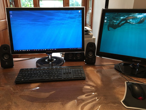
This primary development station currently handles Windows and Android development, as well as Linux, Unity (desktop), Unreal Engine, HTML 5, or almost any other platform for which we build products. It is positioned in the optimal location for seeing outdoors and minimizing reflections (to reduce eye strain).
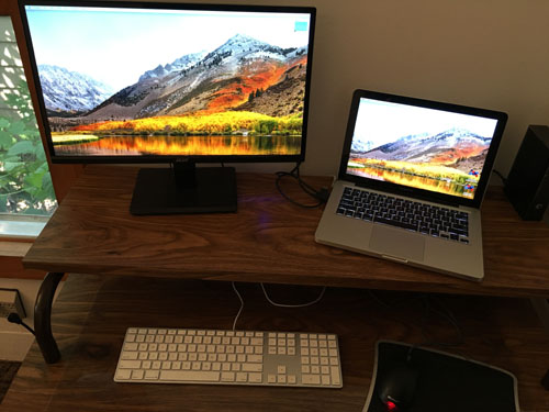
This secondary development station currently handles Mac and iOS development, as well as Unity (mobile), and other platforms when on the road. It, too, is positioned for reduced eyestrain, with minimal reflections and a direct view outdoors.
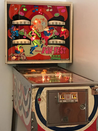
This station facilitates development by giving an opportunity to relax and break away from direct problem solving, which often gives the unconscious mind some time to work the problem, or to simply blow off some steam. This pinball machine is a Williams Fun-Fest, an electromechanical (EM) model produced in 1973, which is fully playable, but slowly undergoing some restoration. It has been accompanied by an original arcade Galaga machine from 1981, but that cabinet currently needs a replacement CRT or board.
This room also houses our primary server, which is headless, and a mobile device station consisting of two multiple device docks capable of charging 15 mobile devices (including Apple Watch) simultaneously, though we still need to charge the iPad Pro pen separately.
Older makes way for newer
In the course of setting up and making room for the latest equipment, we find that there are older systems and devices to be retired from ongoing development. In this go ’round, the following were retired:
- Apple Mac Mini PPC
- iPad (original, still on iOS 3.2)
- iPod touch (2d generation)
- Android 2.2 (Froyo) phone
- Ouya
- Microsoft Xbox 360
Some of our peripherals may be retired as well. Our duplicate X-Arcade Tankstick, as well as the older Dual Joystick and (separate) Trackball devices, are destined for storage. Our Microsoft Sidewinder joystick and Logitech/Momo steering wheel/pedals, force-feedback devices, will stay. We have 4 printers, 3 scanners, and 2 external optical burners (all useful) to optimize, and we have extraneous monitors, speakers, and various network routers and switches to stash. I guess we will retire the fax machine, too. 😉
Efficient usage of resources
Now that the remodeling, consolidation, and configuration of the office is (essentially) complete, we find that we have some extra time for external development projects. In these slow, summer months, we are booked to only about 25% of maximum capacity. If you have (or know anyone who has) need of a massively experienced game developer or team, please check out SophSoft, Incorporated at sophsoft.com.
Of course, we have (literally) 32 more game projects prioritized for development under our Digital Gamecraft brand, plus a separate productivity product (to be announced), but I would love to discuss how we can help you make your vision into a published reality.
Josh Morris
User Experience Designer
A few weeks ago, I wrote the following recommendation:
“I had the pleasure of working with Josh Morris at Daqri and we created extraordinary AR applications together. Josh is a passionate designer with broad capabilities and a strong understanding of the medium. He is also a wonderful colleague; he integrated himself with our development group seamlessly and was able to communicate clearly with both engineers and product managers. The projects incorporating Josh’s work are tangibly better for his efforts.”
Unfortunately, it is now just a remembrance. Rest In Peace, my friend.
UI Lessons from a Terrible Interface
Or, 40 reasons why DirectTV sucks.
Let me preface this by pointing out that I have many, many years of experience with DVR recordings, originally (and still) using various TiVo boxes with Comcast/Xfinity cable, and more recently, almost three years with DirecTV (AT&T) and their Genie DVR.
Despite the claims in their commercials, DirecTV is objectively worse than cable television with a TiVo box. The quality of recordings is noticeably lower in any viewing circumstance, and where there is motion involved, DirectTV just falls over. Anybody who thinks otherwise must either not be discerning, have poor eyesight, or have never seen decent cable.
A few years back, TiVo redesigned its user interface to focus more directly on providing an interface for both cable recording and streaming services; I was not thrilled because it added some complication for me, who (at the time) did not use any streaming services. However, the interface had a clear goal and it achieved that goal with few major glitches.
Earlier this year, DirecTV, presumably as an initiative of AT&T which acquired them just before we signed up (coincidentally), launched a massive interface redesign that completely changed the way customers used the DVR, and not for the better. Unlike the TiVo redesign, this one was very poorly designed, and also poorly executed, resulting in the worst user interface in recent memory.
In this article, I critique many of the failures, large and small, with commentary about the UI principles violated and how we, as developers, can avoid making the same mistakes.
Quality Issues
The fundamental concern about any software is that it performs its function correctly and consistently. It should be properly tested and prove robust before being presented to (or inflicted upon) the general public. Generally, all issues are issues with quality, but there are some that are specific problems with quality assurance:
- The new interface was rolled out to customers before proper testing had been completed. The sheer number of issues listed here is evidence of a massive failure of quality assurance. Lesson: Always test your software completely before release.
- The interface locks up regularly, simply failing to respond in any way, requiring one to turn the DVR off and back to regain control. This is what is known as a “showstopper” bug, one where a user cannot continue. Lesson: Never, ever, ship a piece of software with a known showstopper.
Functionality Issues
The whole purpose of any software is to perform a function. If software fails to perform that function correctly or completely (or at all), then the design and user experience are irrelevant. Here are some of the issues with the DVR simply doing its basic job:
- Recordings arbitrarily start late or stop early. The most fundamental purpose of a DVR is to record a program as requested, not only a portion thereof. This happened with recordings both done in my absence and with live recordings I was actively watching (terminating the recording after only a minute or two). Lesson: Be certain that your software actually performs its basic function before anything else.
- The DVR would get confused and schedule (and perform) simultaneous recordings of the same show, on the same channel, at exactly the same time. Lesson: Do not release software that behaves illogically; it will annoy and confuse customers.
- Before the redesign, one could either record a series on any channel, or on a specific channel; this important functionality was removed, even though the interface still assumes that this is possible. Now, every new series is scheduled for ‘All Channels’, which is especially problematic for heavily repeated or syndicated shows. Lesson: Do not remove useful functionality in software upgrades.
- Arranging a list into priority order is just completely broken. Changing the order of scheduled series causes the addition of duplicate entries into the list. This is fundamentally terrible programming, the inability to handle a list properly. Lesson: Do not hire programmers who cannot sort a list without making it grow.
- Using the back button to return to a previous page does not always work; instead, it often gets “stuck”, but one can do something like opening the list view, then go back multiple times to go back even further. The full undo stack is there, just not working correctly and ending prematurely. Lesson: Be sure to completely test new features.
- The ‘on demand’ functionality provides different (lesser) access on the DVR than from the mobile app. The DVR will report that a show is not available, but then it can be immediately watched on an iPad without difficulty. Lesson: Be consistent with content on multiple platforms; secondary platforms should not have better access.
- The “upgrade” did not fix the playback and compression issues; the recordings still get very blocky and almost unwatchable when there is motion on screen. Lesson: Fix major problems with software before adding new features or other changes.
- The “upgrade” also did not fix the myriad audio issues, where sometimes a recording will start playing without any audio, or live recordings have an audio stutter, or a paused recording will make random pops and clicks. Lesson: Test all aspects of a software interface, not only visuals.
- Now, however, the video also blanks out entirely for a second or two when playback speed is changed (for example, fast forward is started). Lesson: Design a test plan that incorporates current and past bugs to prevent regressions and buggy releases.
Design Issues
Good software begins with good design, which is responsible for the entire user experience. The user experience (UX) incorporates the aesthetics, flow, and interface, and generally works towards making the software easy to understand and use. These are some design issues where the expressed intent works against the user:
- First and foremost, a design should be purposeful, providing a benefit to the end user. This design change adds no value, yet makes the user learn a new way of doing things (at least, the things that can still be done). Lesson: Never change a software interface just for the sake of being different; change must have a purpose.
- In 2018, the DVR still does not have any way to recover accidentally deleted recordings; if you accidentally delete a recording, it is gone forever. (TiVo has had this functionality for more than a decade; Apple has used the concept for 35 years!) Lesson: Always incorporate expected features first.
- In the play list, when multiple recordings of a program are put into a folder, the description chosen is that of the latest recording, which description is most likely to contain spoilers. If one is getting ready to binge a season, the last thing one wants to see is something like, “In the aftermath of the death of <major character>…” Lesson: Consider how the user is going to actually use your software in practice.
- Recordings of marked episodes show the latest (highest episode number) on top, but unmarked episodes (say, with only an episode name) are sorted to show the earliest recording on top, essentially the reverse order. Lesson: Be consistent in presentation, even where the data may not be complete or consistent in format.
- Entries in the ‘to do’ list no longer show the number of upcoming recordings, so to get this useful information that used to be available at a glance, the user now needs to enter (then exit) the information screen for every entry. Lesson: Provide important information immediately (at a glance) rather than requiring additional actions.
- Changing priorities in the ‘Series Manager’ now no longer has a move (drag) selector where the up or down arrows move the entry up or down in the list. There are now separate up and down buttons which need to be pressed with the ‘select’ button. This requires more effort and is far less intuitive. Lesson: Never change an intuitive interface to require extra actions to perform identical functions.
- Because of the change in the move interface, one can no longer move an entry up or down by a page using the ‘page up’ and ‘page down’ buttons. If you add a 100th entry, and you want the priority to be near the middle, you could have to press the select button 50 or more times to get it where you want it to be. Lesson: Always test with a large data set simulating the real world, especially on interfaces that must scale. Bonus lesson: Always eat your own dog food.
- The ‘manage’ option is no longer on the menu anymore; now it appears in the sidebar of the play list. This is an illogical arrangement. Every other selection on the sidebar has a (usually filtered) play list, so ‘manage’ does not belong. Lesson: Be consistent when providing functionality at the same level (e.g., menu).
- The ‘to do’ list (and ‘series manager’) is buried under ‘manage’, rather than somewhere easier to access. It is at the same level as ‘recording history’ and ‘purchases’, which are so rarely used as to border on pointless. Lesson: Frequently accessed features should be more easily accessed than rarely used features.
- The DVR has a completely different behavior than the mobile app, which functions much better. The platform dictates some differences between DVR and mobile app, but there is no design consistency between the two. Lesson: All supported platforms for a software product should have consistent design and functionality.
- If a recording of a show appears directly in the play list, not in a folder, the episode name and number are not shown. This is annoying for a scripted program with a description, but ridiculous when the episode name is the only relevant information. Lesson: Provide the most important information, that which a user will most want to see, at a glance, and only require additional actions to access less important data.
- The ‘to do’ list, likewise, does not show the name or episode number for a scheduled recording, so you have to go to the information page just to see whether this is the desired episode. Lesson: Consider the purpose for which a customer would be using a particular view to determine which information is important in that context.
Usability Issues
Even with a good user interface design, there can be implementation issues that adversely impact the usability of the software and ruin the user experience. Here are some issues where the implementation detracts from the impression of the product:
- The interface has poor performance in general, always feeling sluggish and slow. Lesson: The first rule of user experience is to make the software responsive.
- There is a delay when playing a recording before switching to display the video full screen, so if a program begins immediately, one needs to back it up. Lesson: Where performance is poor or a wait is required, handle it gracefully; either indicate or mask or the situation with animation, sound, and/or other feedback.
- The selected recording on a play list shows an oversized listing (which looks like an ad banner) but removes the normal listing. Lesson: Do not remove the fundamental item view when expanding to provide additional details.
- Pressing the ‘select’ button performs different functions depending on which list the user is viewing at the time, or which level of that list. Lesson: Be consistent with the functionality of a button; do not use it for different purposes depending on context.
- The ‘play’ button on the remote does not play the selected recording at all levels. Lesson: Do not disable logical (consistent) functionality on certain views.
- The ‘record’ button has different behaviors on different lists and different levels. Lesson: Provide consistent behaviors for global buttons, regardless of view.
- Pressing the ‘record’ button in the information view for a recording in the ‘to do’ list removes the entire series, rather than only the episode. Lesson 1: Do not have a button do more than the logical intent. Lesson 2: Never allow a destructive behavior to be performed, without confirmation, on the press of a single button.
- Selecting the ‘move to top’ function in the series manager causes the selected program to move to the top of the list, but the selection then changes to the next item in the list. Lesson: Do not change focus from a selected item unless necessary (i.e., the item was deleted); users expect the same item to remain highlighted.
- When duplicates exist in the series manager (a bug unto itself), moving a program up causes the selection to change. Lesson: Again, do not change the item focus.
- The play list undo stack is not balanced; a user must press the ‘back’ (or left arrow) button twice after pressing the ‘list’ button to return to the original view. Lesson: One action (forward) should require only one ‘back’ press to reverse.
- Pressing ‘back’ to return to a view where a (now) deleted recording was highlighted causes a completely incorrect recording to be highlighted, often within a folder (i.e., one level down), which is very confusing for the user. Lesson: When a highlighted item is no longer available on reversing, select a logical default (e.g., first item).
- The current viewing position of a recording is lost, seemingly randomly. Lesson: Do not lose, misplace, or corrupt user information; it frustrates customers.
- The choice of font size is too small for some users (as reported frequently online). Lesson: Test font readability extensively and provide options for users with impaired eyesight, including colorblind users, if necessary.
Support Issues
Any significant software product is likely to have some bugs or usability issues. Some issues are problems with the customer support provided by the company, such as these:
- This major “upgrade” was rolled out to the entire customer base very quickly. Lesson: When making major user interface changes to a product, test properly with a smaller subset of users to avoid providing a substandard product to everybody.
- The many issues with the new version of the software were seemingly ignored. Lesson: Always listen to customers and address issues as soon as possible.
- There is no way to refuse the upgrade, nor to revert to the older software. Lesson: For a substantial product change, allow users control over when to upgrade and provide a method of reverting (as a failsafe).
- The customer support area is loaded with hundreds, probably thousands, of complaints about many of the above issues, but DirecTV/AT&T rarely ever address any of them, and never with anything positive, personalized, nor useful. Lesson: Always, always, let your customers know that you have heard their complaints, that you appreciate their feedback, and how the issue can or will be addressed.
Conclusion
Frankly, we only signed up with DirecTV because it was the only choice at our location in Los Angeles, and after our experiences, we intend to never use them again. (We have now cancelled the service, with some difficulty and annoyance.)
My message for AT&T is: If you want to actually improve your service, stop spending so much money on advertisements lying about DirecTV being better than cable and spend some on actually making it competitive. Fire the DVR team and use your mobile app team instead. Quit trying to make people bundle your mobile service with your television service, and give them a reasonable monthly price, like the one you offered us only after I was leaving the service. (Offering a 50% discount to stay just pissed me off a lot more.)
And for the sake of everyone, dump that crappy contractor, Consolidated Smart Systems, who is making your company look even worse. They do not have a one star rating on Google, Yelp, and with the Better Business Bureau for nothing. 🙁
Looking Forward to 2018
Happy New Year! 🙂
The Roman calendar started in March (Mensis Martius), so by that measure I am not too late.
OK, so we are already two months into the Gregorian year, and this is only my second post. Frankly, those of you who know me personally will appreciate that I often have a lot to say, but when it comes to setting aside time in my busy schedule to write it down, well, my preference always tends to actual development (and my task list reflects that preference).
So, SophSoft, Incorporated and Digital Gamecraft have been acting like a duck, appearing calm and quiet on the surface, but paddling like crazy under the water.
Yes, we have been ducking. 😉
That said, we have been doing a great deal of development work on a few fronts.
What We Have Been Doing
Recent development work has been divided pretty clearly into three categories:
- SophSoft has been continuing our long-term association with Goodsol Development, and there are a couple of products in the pipeline for release in the near future and, of course, more to come thereafter. There is a major release scheduled for March 21st (stay tuned), followed shortly by our two products, the first of which is already “in the can”, and the other being completed now.
- Digital Gamecraft is going to be releasing Demolish! Pairs for Android soon, in conjunction with the refresh of Demolish! Pairs for iOS, which is currently in progress (as required by Apple). Another game is prototyped and approved for full production once that simultaneous release is (successfully) completed.
- I have been leading a team, the Advanced Concepts Group, at DAQRI, to produce AR (augmented reality) software for enterprises (Professional Grade AR™), including the majority of the Worksense™ productivity suite, as well as the development tools necessary to build applications for the DAQRI Smart Glasses®.
With more than a dozen products actively developed already this year, not to mention also properly purchasing our Michigan home/office during the same period, perhaps that will put some perspective on my lack of blog progress. Now…
What (else) We Will Be Doing
In addition to the work mentioned above:
- SophSoft has another (unannounced) product designed and in the early (prototype) phase. It is a slight departure from other projects we have previously done, but it should be groundbreaking. The first version is scheduled for release in “late Q3”.
- Digital Gamecraft has a planned and prioritized list of game projects to undertake, with four more expected to be developed during 2018. However, we should probably emphasize the “agile” nature of this schedule.
- With DAQRI, there are several exciting (but, alas, non-game) projects scheduled throughout the year and into 2019 and beyond. I am not at liberty to reveal any of these plans, of course, but I have seen the future of industry.
Personally, I have two close family weddings and a big family reunion all scheduled during the summer (in three different months), so I should be increasing my air miles, too.
Conclusion
Everything is looking quite positive, and after Looking Back at 2017, I fully expect 2018 to every more productive and fulfilling. In fact, composing this blog post reminded me why I should be doing it more regularly: it helps me increase both my enthusiasm and my focus.
Looking Back at 2017
Overall Performance Grade: C-
It has been more than four years since we have done a proper ‘Year in Review‘ post and, frankly, it will be still longer before we do a proper one. However, we should take a look back on the previous year and take an honest appraisal of our performance and the work we have done at Digital Gamecraft and SophSoft, Incorporated.
Overview
Excluding politics, 2017 was not a terrible year for us, and for the most part we moved in a positive direction, with no catastrophic setbacks. However, it must be noted that our ostensible performance was disappointing. While we made big strides with internal development, we did not publish enough product (nothing directly from Digital Gamecraft) and did a poor job of communicating and marketing.
When one is spinning plates, it does not take much loss of focus to allow things to come crashing down. Right now, SophSoft is as “streamlined” as it has been since 1994, so with fewer manhours to utilize, we tend to focus on the crucial issues (e.g., paying bills) and the tasks that we perform best and enjoy the most (i.e., development).
What Went Wrong
Because I gave us a below-average grade, we will start with the negatives for 2017:
- We did not publish any Digital Gamecraft products (or even updates).
- One of our Demolish! Pairs products was removed (forcibly) from the App Store.
- Our primary web server crashed (hard) in the summer and we are still recovering.
- Time spent in Los Angeles is far less productive than East Lansing (for reasons).
- The current US Government is attempting to destroy this country for generations.
What Went Right
Now, we can end this with the positives about 2017:
- We essentially finished Demolish! Pairs for Android and it plays great.
- Another (unannounced) project made great strides after languishing for years.
- Our collaboration with Goodsol Development continues productively:
- Pretty Good Solitaire Touch Edition 1.50 (for iPad)
- Goodsol Solitaire 101 version 2.30 (for Windows)
- Goodsol Solitaire 101 Mac Edition 3.10 (for Mac)
- Goodsol Solitaire 101 Touch Edition 1.50 (for iPad)
- Most Popular Solitaire 2.30 (for Windows)
- Most Popular Solitaire Mac Edition 3.10 (for Mac)
- Most Popular Solitaire Touch Edition 1.50 (for iPad)
- FreeCell Plus 4.30 (for Windows)
- FreeCell Plus Mac Edition 4.36 (for Mac)
- FreeCell Plus Touch Edition 1.50 (for iPad)
- Action Solitaire 1.60 (for Windows)
- Pretty Good Solitaire Mac Edition 3.40 (for Mac)
- Pretty Good MahJongg 2.60 (for Windows)
- Our skills and capabilities continue to improve and expand.
- SophSoft remains the oldest independent game developer in the world.
Conclusion
Ultimately, being disappointed with shipping an average of more than one product update per month is probably a good thing; however, we can definitely do better, and that will be the subject of my next post, Looking Forward to 2018.
Dead Server was Dead
The Gamecraft blog hiatus is now over.
Back in the summer, our primary web server died. When I say, “died”, I mean that it completely lost power suddenly and never came back on again.
Fortunately, we had a much more powerful server already online ready to take on the new hosting responsibilities (having been acquired to do just that). Alas, the transition was planned to be a slow rollout, not an under-the-gun quick turnaround.
Resource prioritization
There were some services provided by the late server that needed to be replaced and restored post haste, so those clearly had priority. However, the number of employees here skilled to handle server administration duties can be counted on the index finger of my left hand. We took care of the emergency issues as soon as possible, and then we triaged services that felt like high priorities but which could actually wait.
Restoring this site was one of those lesser items. The measurable ROI (return on investment) for the blog was negative, it takes a significant amount of time to manage and provide content, and the readership was dropping far below its peak. In fact, we had been cutting back on the number of posts out of necessity. On the other hand, we had as much contract work as we could handle, one product needing some critical attention, and a new project in danger of falling further behind our planned (albeit arbitrary) schedule.
After getting over the initial emotional reaction and making the decision to wait to restore the blog, it became easier to keep pushing that effort further into the future. Not only did we save (well, postpone) the immediate time requirements, we also saved the time it takes to write original content and maintain the site.
As an interesting bonus, traffic to our Facebook page increased by 1600% shortly after the server went down. However, that boost was short-lived.
The intangibles
I surmised that the unexpected boost to Facebook views, which trailed off reasonably quickly (especially since we have not posted an update there in a long time), was actually an influx of blog readers checking to see whether we were still “alive” as a company.
We were very much alive, just too busy (and short on resources) to restore the blog.
Additionally, there were a small number of items that came up which we would have liked to communicate to our readers, but given that such a post required the initial time investment to revive the blog, many of these were simply dropped or forgotten. We have also had three (unannounced) product update releases during this “hiatus”.
Finally, however, I made the call to relaunch the blog when we had a lull in time-sensitive work, combined with a number of upcoming announcements in the next few months (not to mention a growing concern about the impression left by a landing page).
As is so often the case with such tasks, once the decision was made to go ahead and get it done, it took less time than feared and embarrasses me to have procrastinated so long.
We are back
Now, the Gamecraft blog is back, and we have lots of posts to make and, as noted above, expectations of news to announce in the coming weeks. Of course, because of the abrupt and complete failure of the previous server, there are still a few niggles that have to be worked out of the system, and a few changes to be made, but that is always the case.
Welcome back, readers!
Curmudgeon Day 2017
Stay home and do exactly what you want.
It is Curmudgeon Day again. This is a day to stay safe at home, avoid the insane traffic and idiotic spending, and do something that you want to do.
This year, I watched practice for the Abu Dhabi Formula 1 Grand Prix, put on some comfortable clothes in which to lounge around the house, played some games, and write to you just before I work on a personal project that makes me happy. Food consists of turkey sandwiches and cherry pie left over from Thanksgiving dinner.
Last year, I celebrated in style by not writing about Curmudgeon Day. 😉
For more information about this holiday event, read my previous Curmudgeon Day posts, which I have been writing since I started this blog back in 2004.
Please feel free to comment on how you spent your Curmudgeon Day.
… and stay off of my lawn!